Using Soft Greens
Like a gesture of kindness, soft greens make us settle in and feel comfortable. Representing Mother Nature in her gentlest mood, celadons, celeries, and jades, collaborate perfectly with pale pinks, off-whites, misty neutrals and other considerate hues.
Benjamin Moore
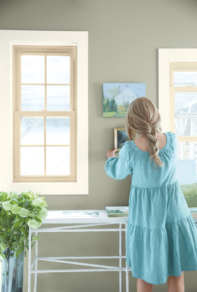
Drawn to colors found in nature, Andrea Magno chose several soft shades of pink, blue, beige, and green … like the shade called October Mist shown here. “The colors of our natural surroundings are familiar and comforting, with an air of stability and reassurance that gives a rooted feel to interiors.” Check out our article about her 2024 spring paint predictions.
Emily Mann
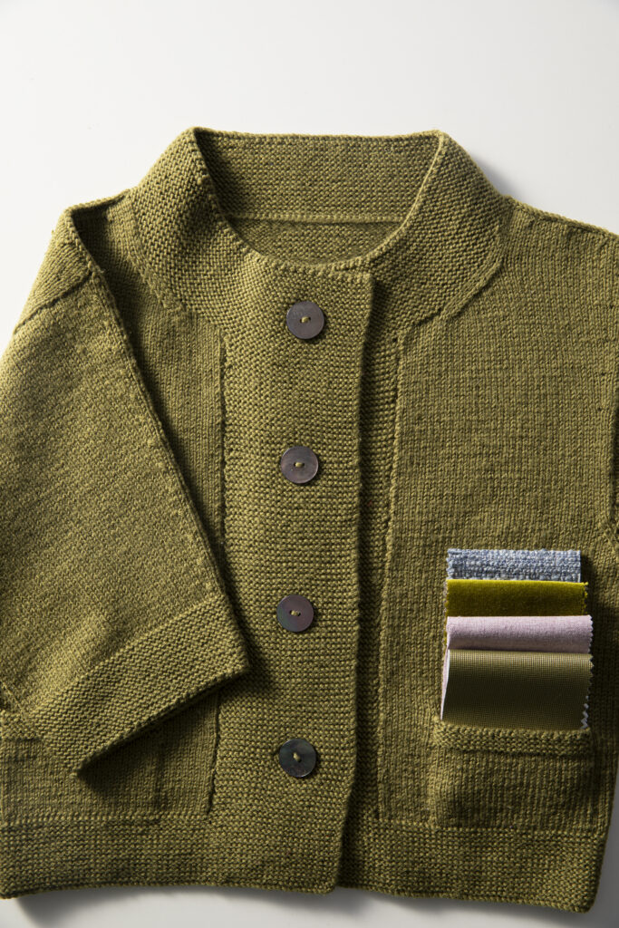
We asked designers to pick their favorite color right now, and hospitality interiors expert Emily Mann chose an off-green, the color of a sweater she bought in the ‘90s. For Mann, this hue represents everything from childhood swims among kelp beds to eating olives in Valencia. She tucked into the sweater’s pocket a few fabrics she’s working into an upcoming hotel project. We’d stay in that palette anytime! For other designers’ fave hues, check out our article on our favorite colors.
Peter Dunham
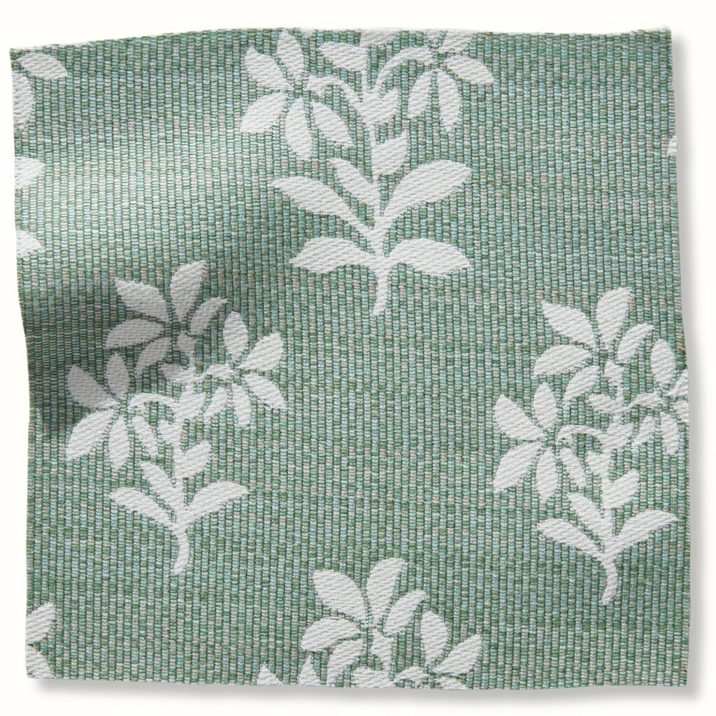
Famed interior designer Peter Dunham chose a soft green for its association with spring. “After the claustrophobia of winter, I gravitate toward airy colors, particularly pale green. It’s earthy yet fresh, and is the ultimate sign that spring is coming!” For more insight into what colors designers are drawn to check out our favorite colors article. Shown here is Asha indoor/outdoor fabric by Peter Dunham Textiles. To the trade.
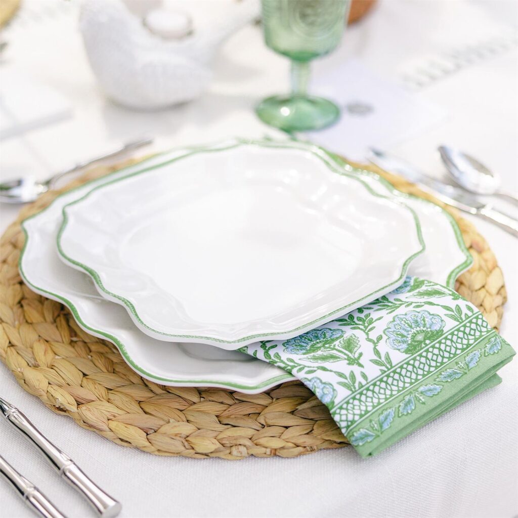
Picket Fence
Is there anything more festive than eating outdoors in fine weather? Carry these plates, edged in a lovely green stripe, with confidence! They’re made of durable, BPA-free melamine. Available in Shadyside.
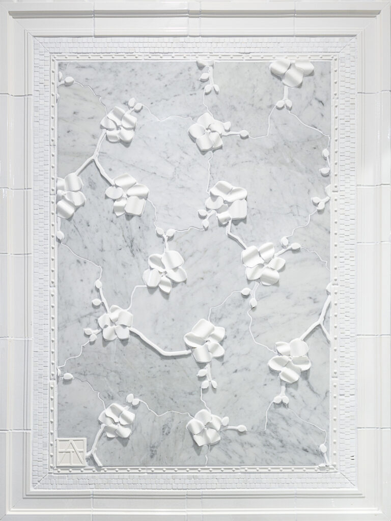
Splash
Splash co-owner Kristen Nicklas was drawn to the irresistible freshness of Orchid, a tile pattern born of a collaboration between homeware and jewelry designer Michael Aram and Artistic Tile. The melding of realistic floral details with polished black or white marble backgrounds is indeed gorgeous. Made in both dimensional or flat versions. Available in Pittsburgh.
Integrating Mineral Tones of Green
Is your home your castle? Of course it is, and a castle sometimes calls for a color that’s resolute, firm, and strong. But also welcoming and supportive. The mineral tones of green marble and weathered turquoise communicate these messages very nicely. You feel steadied and reassured in their presence.
Suzanne Tucker
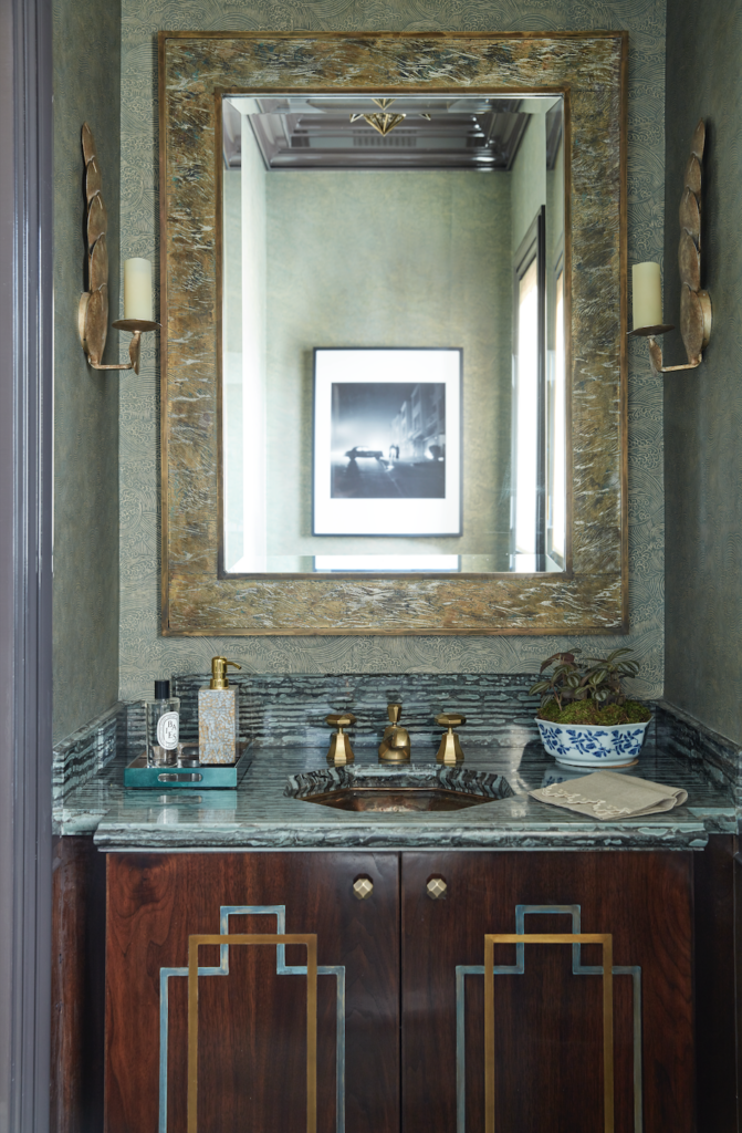
Suzanne Tucker’s favorite color is a shagreen green somewhere between jade and sage, inspired by her collection of antique eyeglass cases. “They were the inspiration for the jewel box powder room I recently designed for a San Francisco family home–a little bit Deco, a little bit glam, and a whole lotta chic!” Visit tablemagazine.com for more designer picks.
Weisshouse
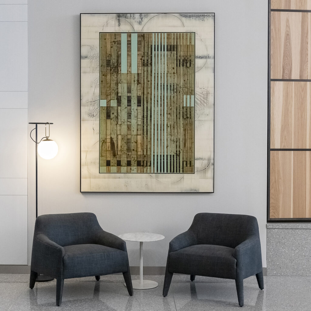
A work by Pennsylvania-born artist Michael Kessler completes an office lobby recently created by Ron Reinheimer, member of the interior design team at Shadyside store and design firm Weisshouse. Kessler’s geometric zones of diaphanous color show us how a sophisticated range of mineral greens can interact with ambers, parchments, and dark neutrals. In order not to distract from such an impressive anchor, Ron kept other choices simple with an elegant pair of Verellen armchairs.
Story by Stephen Treffinger and Keith Recker