Sometimes something catches your eye — a shape, a texture, a color — and immediately takes hold of you. It feels as if you’ve never seen it before, or that you’re seeing it in a whole new light. For me, it was the color Eau de Nil, revealed during a particularly interesting lecture about ancient Egypt’s representation in art and design on a Viking cruise on the Nile. I’ve always loved celadon, but this shade is a bit less obvious, a bit more elusive. There are even differences of opinion as to what the color actually is, whether it’s bluer or greener or grayer. I’m officially obsessed!
With this in mind, we reached out to interior designers to share their favorite colors of the moment, hues that have crossed over from mere swatches or ideas and become something more, something that has captured their imagination — and won’t let go.
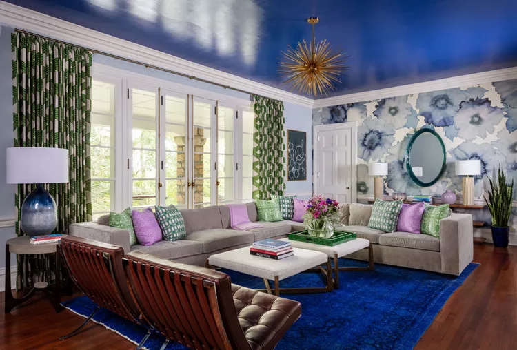
This living room features a gorgeous lacquered blue ceiling that perfectly complements the area rug in the space. It’s a great idea to look at your decor and accessories for color inspiration. (Photo by Nick Sargent. Design by Betsy Wentz)
Betsy Wentz
YInMn-Blue (pronounced “yin min”)
“Discovered in 2009 and noted for its vibrant, near-perfect blue color. We took a family trip to Mustique in the West Indies and the colors were so vivid — from the sky to the water to the food to the sea turtles — the whole place is really special.”
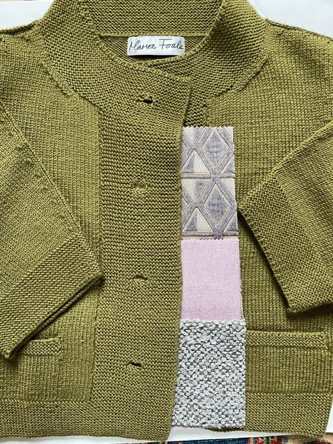
Photo by Emily Mann
Emily Mann
The off-green of a favorite sweater
“My favorite color is “off-green” as I call it. I have a Marion Foale sweater I bought at Barney’s in the ‘90s that is the perfect shade. It’s like the kelp I encountered swimming in Hingham Harbor as a girl. It’s the color ferns get when they are slowing down and moving from summer’s bounty to winter’s dormancy. It’s the olives in Valencia in Spain, so yummy! Or in Madrid, stuffed. My mother recognized how much I loved it and while growing up, if she saw it she’d say “That’s your green, Emily.” I gave the sweater to her at some point and had forgotten about it. When she died last year, I was so happy to find it again. So now it is both of us intermingled forever.”
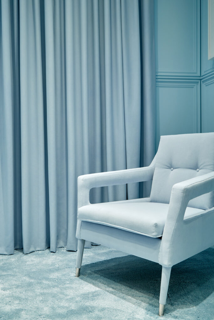
Munna Chantal armchair with polished nickel feet covers, upholstered in Creation Baumann. The curtain is Maharam’s Valor in color Alfresco. Photo by Garrett Rowland
Ghislaine Viñas
The blue of nudibranchs (vibrant sea slugs)
“While I’m certainly not a pioneer in drawing inspiration from nature, nudibranchs, vibrant little sea slugs, continue to mesmerize me. The serene powdery blue they exhibit is swiftly becoming my favorite go-to neutral. Its calming effect is unsurprising, given that every person has encountered this color while gazing up at the sky.”
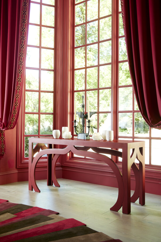
Photo of Fisher Wiseman’s Casablanca console
Jeffry Weisman
Venetian red
“Venetian red is our current obsession because of the drama and warmth it gives a space. The glow of the color draws you in and is happy. As a background, so many colors and materials stand out against Venetian red. We love the color in paint, in velvet, and in lacquer. It’s classic and modern.”
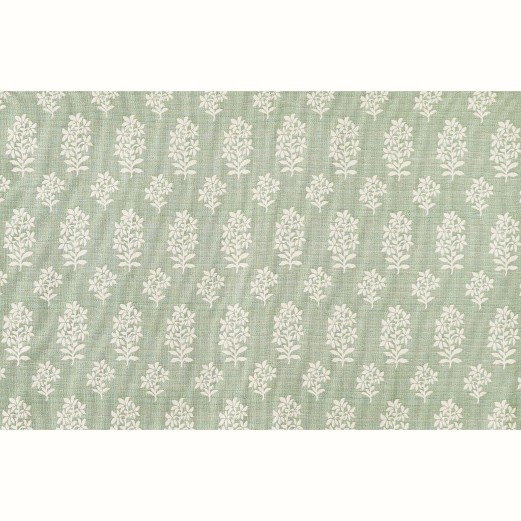
Photo is of Asha indoor/outdoor fabric in Pale Green by Peter Dunham Textiles.
Peter Dunham
Pale green
“After the claustrophobia of winter, I gravitate toward airy colors, particularly pale green. It’s earthy yet fresh, and is the ultimate sign that spring is coming — or finally here!”
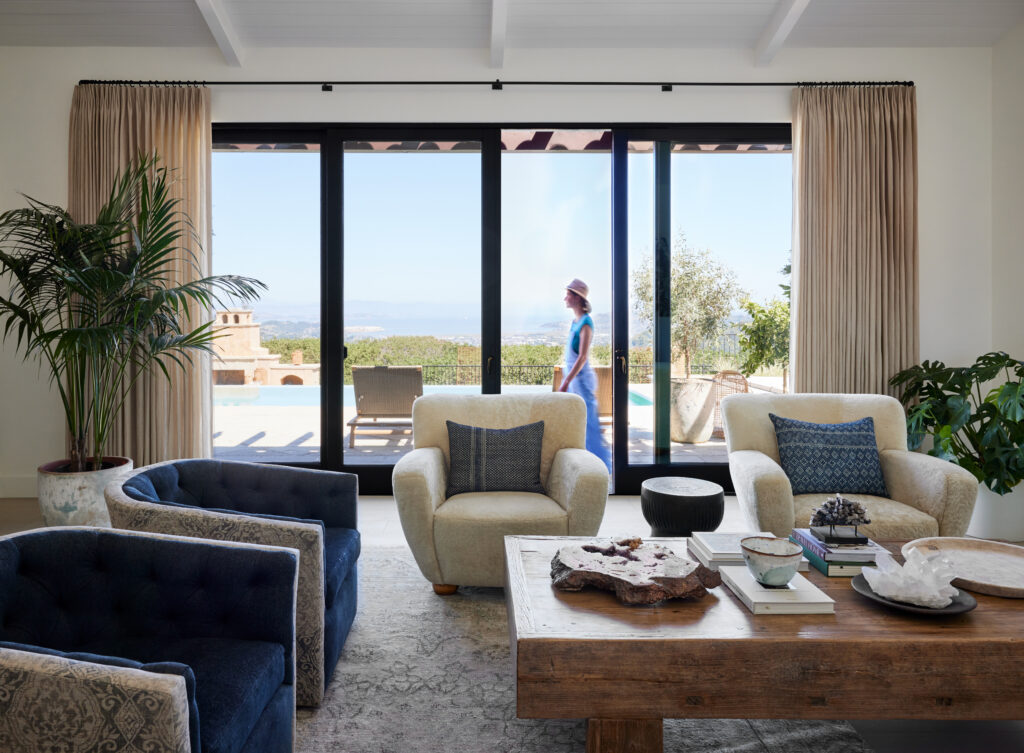
Photo by Skornicka Designs & Construction
Susan Skornicka
Denim blues
“I love designing with denim blues. I am always inspired by the hues of the ocean and the sky when looking through the windows of our homes. Taking cues from the surroundings, I create comfortable environments to live in, that are grounded in a cool and natural ambience. I also live in denim jeans. In my opinion, denim is the perfect neutral in home design and fashion. And it never goes out of style.”
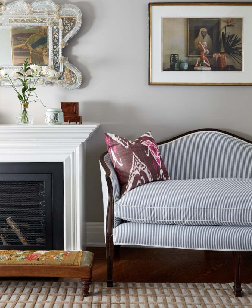
Interior Design by Suzanne Tucker, Tucker & Marks. (Photo by Roger Davies)
Suzanne Tucker
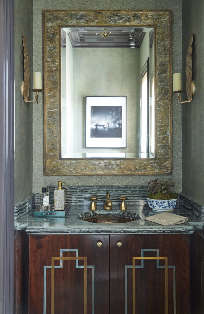
Shagreen green
“I have always had a soft spot for shagreen green, a sophisticated and cool shade somewhere between jade and sage. Case-in-point: my growing collection of antique shagreen eyeglass cases. They were the inspiration for the jewel box powder room I recently designed for a San Francisco family home: a little bit Deco, a little bit glam, and a whole lotta chic.”
Allison Tick
Various colors
Brooklyn-based Tick sticks to a few colors that are always on her mind. She chose a selection of Benjamin Moore wall colors that she feels go beyond trends. “I tend to like colors that aren’t immediately definable, and change with varying light qualities throughout the day,” she says. Himalayan Trek, for instance, is “a warm gray, with lavender undertones.” Grey Owl is “pale enough to be subtle, but saturated enough to provide interest.” She deems Glacier Lake her “favorite robin’s egg blue. The best soothing bedroom color.”
Story by Stephen Treffinger

Subscribe to TABLE Magazine‘s print edition.
