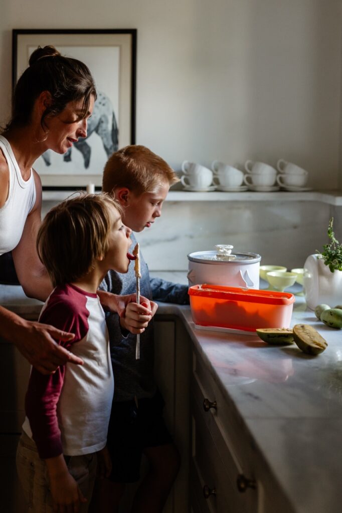
A deciduous and lesser-known fruit-bearing tree native to the eastern United States, pawpaw fruits are the largest edible fruits native to North America and are available for foraging from August to October.
Foraging Pawpaw Fruits and Making Ice Cream
The pawpaw tree is often in parks and along many Pittsburgh streets. The trees mainly grow under the canopy of the woods, but because they thrive along waterways, they’re often called “river fruit” in the three-river city.
Many describe the flesh of the yellowish-green orbs as having a banana-mango flavor.
Pawpaw fruits creamy texture lends itself beautifully to a homemade ice cream and it can become an easy yearly tradition to hunt for the prize ingredient, then churn it into a custard and scoop atop cones. Local author, Andrew Moore, has much to say in his book, Pawpaw: In Search of America’s Forgotten Fruit.
The creaminess of the pawpaw fruit is great for making into it ice cream.
Ingredients
Scale
1 1/2 cups mashed pawpaws, about 4 or 5 pawpaws
2 cups cream
2 cups milk
1 cup sugar
1 tsp vanilla extract
5 egg yolks
Instructions
In a non-reactive pot, heat cream, milk, and sugar over medium heat.
When the mixture starts to steam, beat the egg yolks in a bowl.
Stirring the eggs all the time, add ¼ cup of steaming cream mixture to the eggs. Repeat.
Once the eggs are well combined, add egg mixture to the pot.
Stir the custard often while it regains its steaming point. When it thickens — it should coat the back of a spoon — turn off the heat and pour the custard into a bowl. Stir in the vanilla extract. Place in refrigerator to cool and set.
When cool, whisk in the mashed pawpaws until well combined.
Pour mixture into an ice cream maker and churn according to instructions.
Serve when ready or place in container with lid. Completely cover the surface of the ice cream with plastic wrap. Place lid on container and store in freezer.
The classic martini is an invitation to channel your inner James Bond, but make sure it’s stirred not shaken. A well-made martini should always be stirred because, as James first reminds us in the 1958 novel, Dr. No, the shaking bruises the ice and further waters down the cocktail too quickly. Instead opt for a rapid stir to mingle and chill the simple ingredients.
Why an Ever Martini?
Aside from sounding cool, the name refers to Genever, the Dutch predecessor to gin. Genever tastes like a blend of gin and a light Scotch whisky, with a prominent malt backbone and subtle notes of herbs and spices, including juniper. That’s all the more reason to stir this martini rather than shake it, to preserve the complexity of the flavor.
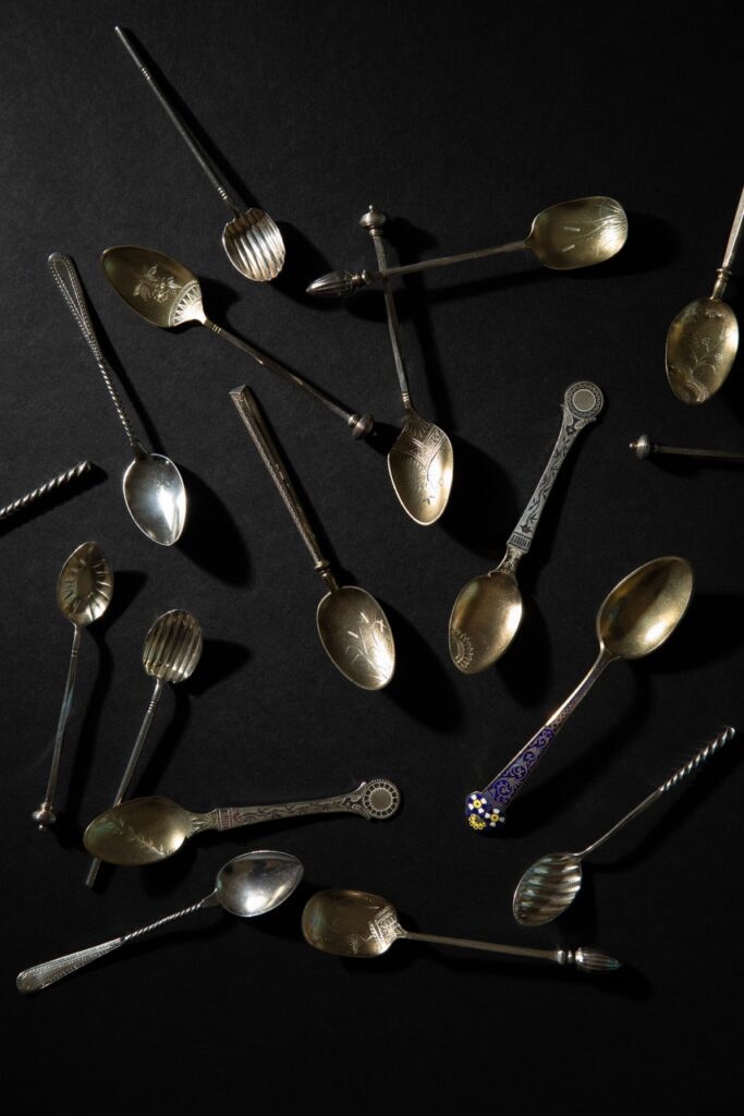
Clayton, the Frick family’s Pittsburgh home, sheltered Henry and Adelaide Frick and their three children. It also housed the numerous staff members who kept the Fricks looking polished and well organized. Hands from both groups played roles in acquiring, using, and maintaining the objects that populate this splendid museum today. The Frick Pittsburgh’s Chief Curator and Director of Collections, Dawn R. Brean, and Morgan Lawrence, Manager of Collections and Exhibitions, shared some of Clayton’s gilded tableware treasures with TABLE readers.
The Frick Family’s Gilded Tableware
Bonbon Spoons
“You never would touch any food with your hands, only with a utensil,” comments Dawn R. Brean. These elaborate spoons would have served chocolates and sweet treats during an elaborate lunch, teatime or dinner. The spoons were probably given to the Fricks as wedding gifts in 1881. No longer part of our daily lives, the bonbon spoon is one of many types of tableware that were an opportunity for the wealthy of the Gilded Age to show off their status and their understanding of the multifaceted table manners of the day. If you could navigate your way through the accoutrements of the upper classes, you belonged. As today’s teens might say: IYKYK.
Venetian Goblets
Like many across the centuries, the Fricks purchased souvenirs and keepsakes when they traveled. During an 1893 visit to Venice, they selected a suite of engraved and gilded coupes, goblets, cordial glasses, finger bowls and plates, decanters, and ice cream shells (dishes) from a luxury boutique run by the Testolini family on St. Mark’s Square. (It’s now Pauly & C., and you can still visit their gorgeous store in the heart of Venice.) Adelaide Howard Childs Frick’s monogram, AHCF, is etched into each piece. This is because choosing these items, and deciding when to use them, was squarely in her aegis. Brean says that the amount of wear and tear visible on the gilding indicates that these sumptuous pieces had frequent use.
Coffee Spoons
Brean reports that The Frick Pittsburgh has at least 30 coffee spoons in the collection. Some are gilded. Others sport enamel details. Some are twisted, hammered, or stamped. Still others are finely etched with flowers, insects, fans, and other details, often in the Japanese-influenced aesthetic popular in the American Arts and Craft movement. Some may have been given as wedding gifts, but their profusion suggests that they may have been gifted to the Fricks across many years. The spoons would have been used during coffee service after dinner, at card parties, and perhaps during the quick social calls that were common between women in the late 19th and early 20th centuries.
Cabinet Plates
These beauties almost never left the dining room’s china cabinets, where they would have provided a sumptuous backdrop for Mrs. Frick’s crystal and glassware. The array of patterns shows a late 19th century taste for eclecticism. These represent Art Nouveau, Rococo Revival, Directoire, Classical, and Aesthetic styles, among others. “What I love about the 19th century is the mixing and matching. They were shameless materialists back then, and more was definitely more,” comments Brean with humor, noting that the museum has at least 15 sets of dinnerware that belonged to Mrs. Frick. What was on the table during meals? “White china with simple gilded decorations was used everyday. On special occasions, however, patterns like the one on the lower left of the photo were likely to be on the table,” explains Brean.
Silver Place Settings
Most likely a wedding gift or wedding purchase, the sterling silver salad and dinner forks, and soup and dessert spoons, shown here are by Tiffany & Co. Popular in the 1880s, each of the 15 shapes within the Audubon pattern had its own bird and flower combination, bringing joyous depictions of the natural world to every meal. Mixed in with the Audubon pattern, the pearl-handled knives were also part of the Fricks’ everyday tableware.
Serving Pieces
The berry spoon (top), fish knife (center), and pie server (bottom) represent some of the many, many shapes required at Gilded Age tables, but which have fallen out of common use in our time. Who could spot a fish knife these days? Just over a century ago, however, subtle differences in their shapes would have explained the function of each piece to those in the know. Mrs. Frick, raised in a well-to-do family, would have known her way around these objects. So would the English butlers who helped her run Clayton over the decades, like Frank Richards and Joseph Holroyd. Mr. Frick, not born and raised with this sort of status-affirming kit, might have needed a little coaching from time to time.
To learn more about the Frick family and the people “downstairs” who made life at Clayton possible, get a ticket to the Gilded, Not Golden tour of the house. It looks beyond the opulence and into the upheaval and inequity of the era.
Special thanks to The Frick Pittsburgh, Dawn R. Brean, Kristin Garbarino, and Morgan Lawrence.
Ippolita’s Classico Icons collection places gently hammered finishes with the boundaries of smooth edges and timeless shapes. Shown here in silver, and also offered in gold, this is the kind of jewelry you put on and never, ever take off.
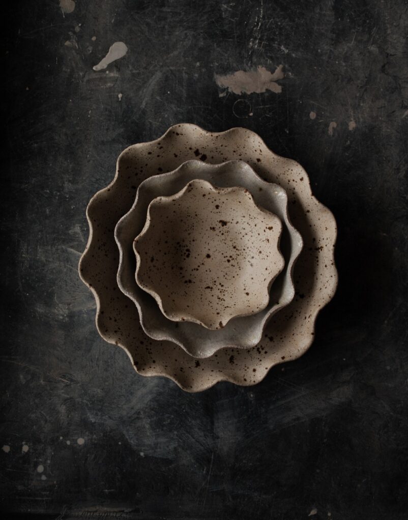
Pittsburgh-based ceramist Elise Birnbaum has a way with clay. Her organically inspired Ripple Bowls are at once uplifting and grounded. Great for your own home as well as for gifting.
Slide comfortably into Jabara Amor Sliders by 4CCCCEES. The open-toe design sports a wide, artfully gathered strap and ridged cushioned sole. The tan, neutral colorway is hot right now in design, so… get on it!
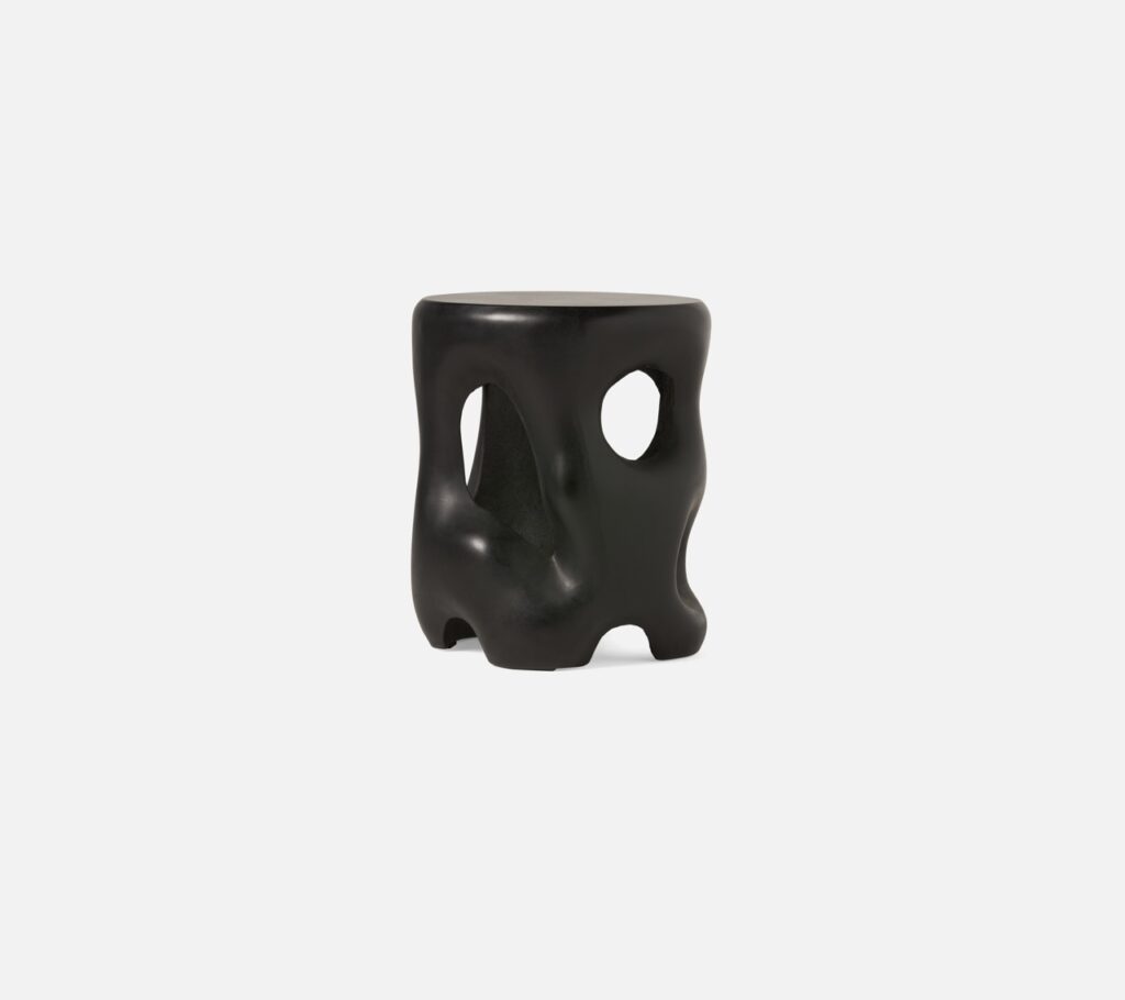
An eye-catcher for sure, the Hyde side table and stool is handmade in smooth concrete, and can withstand use outside on a covered porch. Or of course inside. Wherever you need it. Available in Lawrenceville at Shoppe B.
Clean-lined, minimalistic chairs flank a round, solid wood tabletop resting on elegant wood and metal supports. Both from Canadel and available in 12 finishes from Today’s Home.
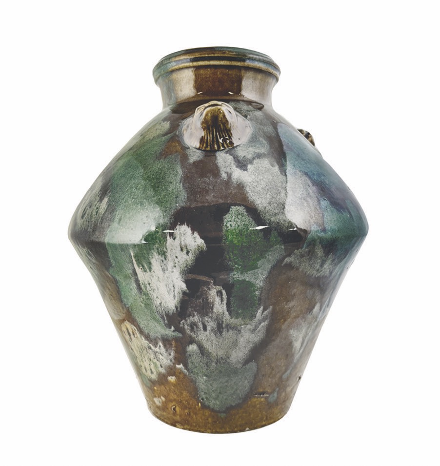
Stoneware architectural vases by Jen Allen Ceramics are exclusive to Fallingwater. Their hand-built slab forms celebrate the convergence of architectural excellence and natural beauty of Frank Lloyd Wright’s architectural masterpiece. Photo by Dave Bryce.
Story by Stephen Treffinger, Danny Mankin, Keith Recker, and Abbey Cook
Why do leading trend agencies, paint brands, and others, choose a color to express the feeling and emotion of an entire year on this complicated planet? Trend Bible’s US trend editor and TABLE Magazine contributor Abbey Cook gets into it by analyzing the 2025 Colors of the Year.
Analyzing the 2025 Colors of the Year
For the past 25 years, we have been living in a Color of the Year-inflected world where leading trend agencies and paint brands choose a color of the times. Why do they do it? Love them or loathe them, their choices focus our attention on the choices the design world offers consumers, arguably whetting our appetite for options that suit us. Color of the Year programs receive lots of press coverage, giving companies a chance to affirm their expertise and cement awareness of their work broadly in the marketplace. Let’s look at four companies who sparked up the color conversation with their picks, along with Pantone, who also pioneered the concept in 2000.
Color is powerful and creates change, not just in our homes, but all around. It should be noted these colors aren’t randomly plucked from a hat. A great amount of research and thought goes into choosing why companies see these individual colors as important in the year to come. Art, fashion, climate change, politics, restaurants, social media, and just about everything you see and touch, are studied by trend forecasters and color strategists, helping to determine the mindset and culture they expect to see in the coming year.
How All the Colors of the Year Come Together
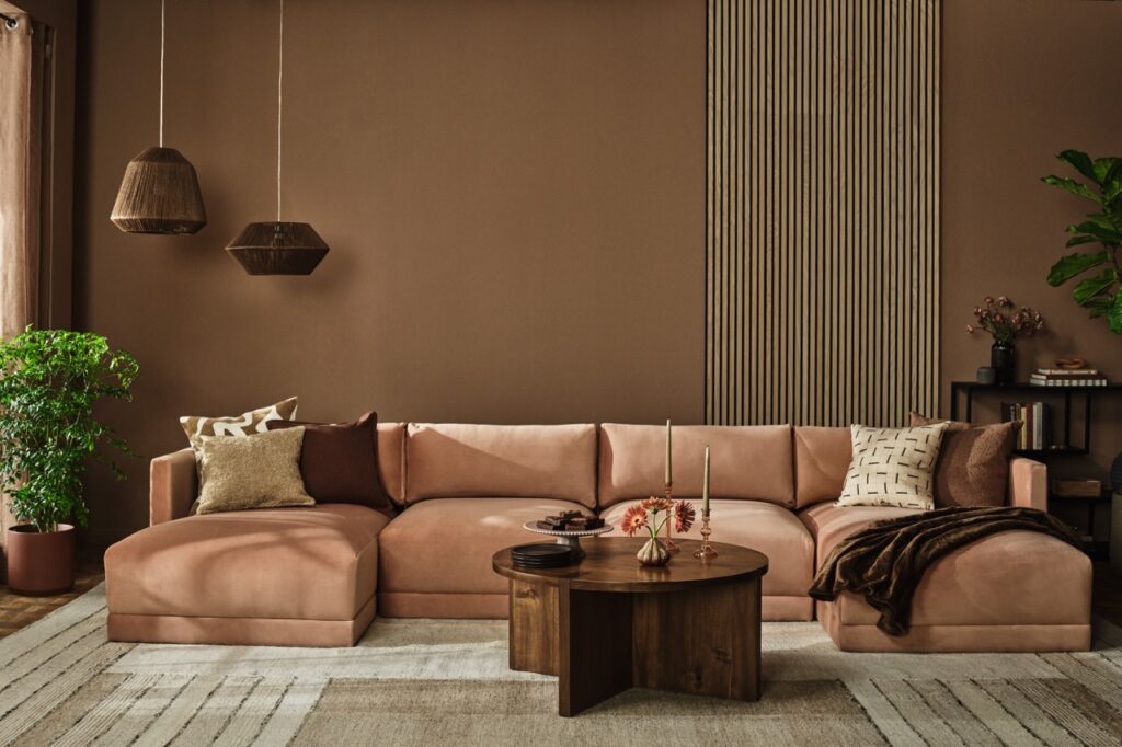
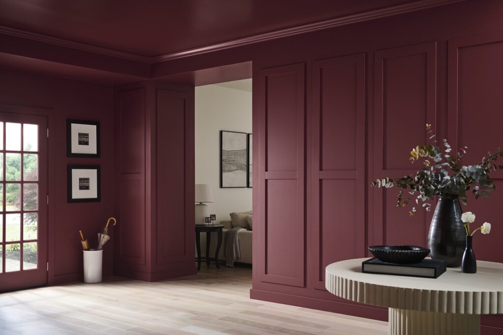
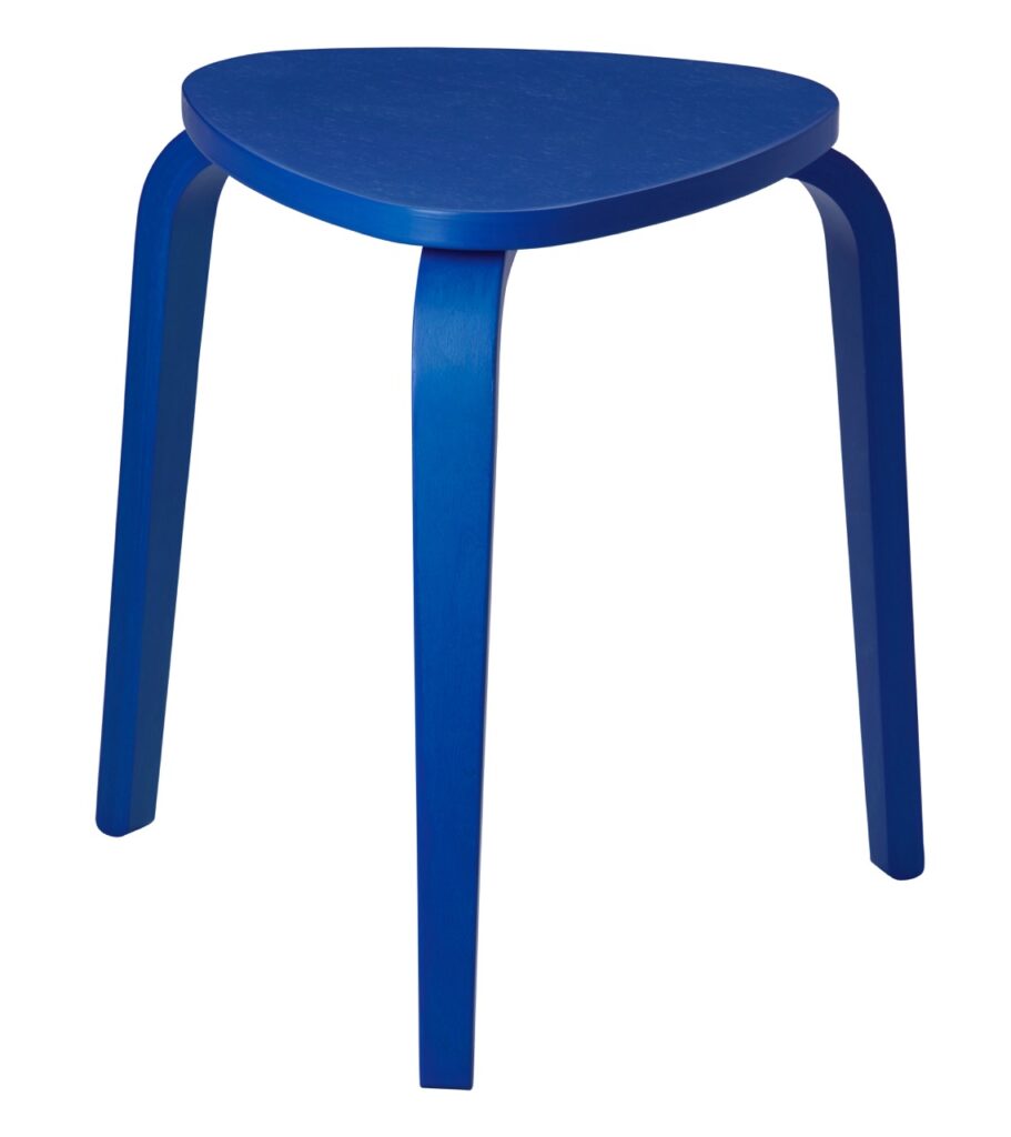
To our delight, displaying these five 2025 Color of the Year choices side by side formed a designer’s dream palette. Together they create an earthy and comforting range, with bold blues that contrast beautifully with the browns and reds. The delicious invitation to mix and match the choices of the five influencers we chose sets 2025 apart from previous years.Perhaps this is a sign that 2025 can be, recent news cycles notwithstanding, a year of coming together collectively to focus on the planet and each other while helping to design the world into a more united place.
The company that put Color of the Year on the map has chosen Mocha Mousse for 2025, a milky tan with cinnamon undertones alluding to the trusty basics we know as brown and beige. This is not a wild card choice for 2025: we needed a soothing neutral after years of dopamine brights ready to be photographed for the ‘gram.
Mocha Mousse acts as an elevated brown that will be found in accessories, wood furnishings and textiles throughout the home. Who wouldn’t want to wrap themselves in a luxurious Mocha Mousse cashmere blanket? Or lean into the cafe vibe of this color and use it in the kitchen with earthen tabletop pieces from East Fork Pottery or Heath Ceramics while you brew your cafe latte. One could even merge food and design by spooning real Mocha Mousse into a chocolate-colored bowl: our eyes would admire the monochromatic still life as much our taste buds. However the color is used, the beauty of working with it lies in its harmonious and grounded sophistication and its unassuming but all-knowing air.
Behr chose a sultry ruby red with brown undertones and spice notes that has timeless appeal. According to a recent survey commissioned by Behr, “More than three-quarters (76%) of Americans would consider painting a room or wall a shade of red and more than half (61%) agree bold red walls feel warm and captivating.” The beauty of Rumors lies in its duality. Like a good friend, it invites you into a room and envelopes you in a warm hug. Yet it’s also luxurious enough to transport you to a five-star hotel. It pops against light neutrals and adds a flair of depth and drama when paired with dark woods.
This is the perfect shade to introduce into a dining room or kitchen as it stimulates the appetite. The confident red transitions well into any room bringing a wealth of hospitality to an accent wall when set against a fireplace or in a powder room to jazz up a cozy environment. This is a classic red that boldly adds depth and comfort to the Color of the Year lineup.
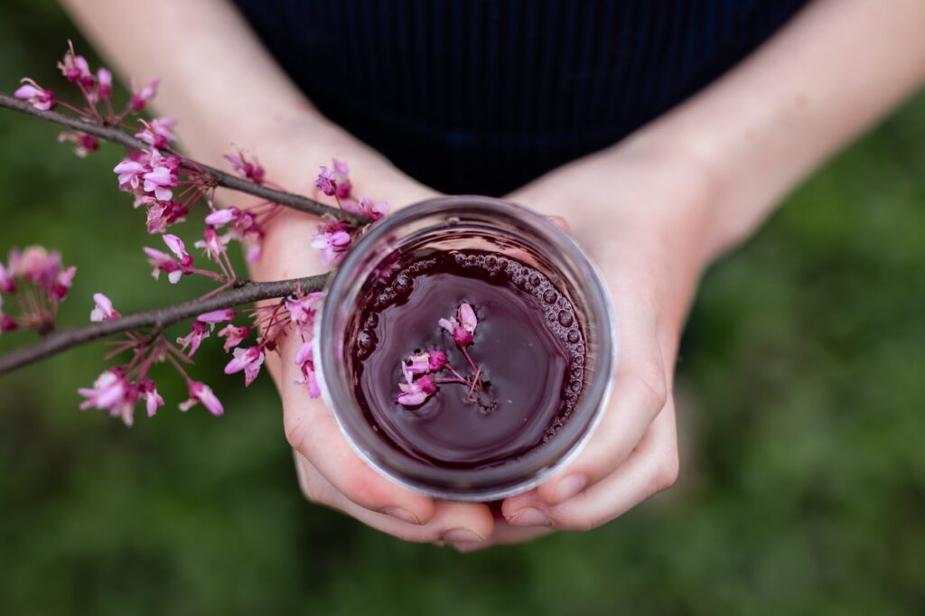
A nuanced mix of “heathered plum and velvety brown” makes up Benjamin Moore’s Color of the Year, known as Cinnamon Slate. A new neutral with hazy undertones, this is a great color to change things up with big impact but without a lot of unnecessary noise. It works well with browns from caramel to chocolate, textured creambouclés and even a rich indigo like WGSN’s Future Dusk. The color’s mauve putty value will soften any room, suggesting a serene escape into the English countryside. Pair it with a chintz floral wallpaper to emphasize sensation. A bedroom accent wall in this muted color would create a soothing environment while still injecting some character.
For a modern take on a Southwest desert style, use it as a backsplash in the kitchen as the color nods toward an adobe stucco. Forecasters think we will be entertaining more at home in 2025, and we are likely to see tabletop textiles and accessories in this color. Look to heritage-crafted products such as block-printed linens from Soil to Studio where folk inspired florals pair with imperfect stripes.
Like Pantone, WGSN is one of the top trend forecasting agencies in the world. Major brands and retailers look to the agency’s experts for guidance in creating and marketing new products. Their 2025 color, Future Dusk, is a saturated, celestial indigo that is “familiar and futuristic”, mirroring the unknown characteristics of this complex year. An otherworldly color, it adds a bit of regal, intriguing flair to the home. It is alive enough to carry a hint of eccentricity and electricity, and yet, as a blue, stable and familiar enough to be a versatile player.
Paint a small room in this opulent shade to feel like you’re stepping inside a satin lined jewelry box. Or use it sparingly in accessories to provoke and engage the eye and invite the seer to stay for a while. Limning between purple and blue, this moody color almost suggests iridescence and would radiate on tiles like the handcrafted ones from California-based company, clé. It would also make sumptuous wallpaper in tonal patterns to dress up a small bathroom or enliven a living room.
For the first time ever, IKEA decided to join the Color of the Year cohort. Even though it’s a lifestyle brand, their use of color and style has long been a leader in the interior design industry, so it makes sense to add their name to the game. They chose Electric Blue for 2025, a color that stands out and commands attention.
This vibrant blue is the perfect accent for home accessories, much like jewelry completing an outfit. It looks fresh when applied on a modern silhouette, such as IKEA’s minimalist Kyrre stool, which packs a perfect punch of color in a kitchen or bathroom corner. Or update a retro lamp in a glossy finish to make an office desk pop with the click of a switch for a literal Electric Blue moment. This color is loud and energetic, adding playfulness to the ‘kidult’ trend that will be big in 2025. Create this style using fun décor pieces such as quirky clocks or whimsical patterned pillows. Consider this color to be your standard of cool in accessories that will work for years to come.
Frank Lloyd Wright and the Kaufmann family envisioned living in harmony with the natural world. Fallingwater realized their shared dream, and a new book published by Rizzoli launches on April 1 to help us experience it as they did.
Get a Deeper Look at Fallingwater with a New Book Release
Fallingwater: Living With and In Art, edited by Justin Gunther and Scott W. Perkins and also featuring photography by frequent TABLE Magazine contributor Dave Bryce, makes the most famous house of the 20th century ours. Its intimate views of Wright’s masterpiece make us feel as if we are walking through the house at our own pace, through the daylight hours and into the evening, and across the seasons. We feel as Edgar Sr., Liliane, and Edgar Jr. must have felt when they were in residence: comfortably seated, drink in hand, we contemplate the beauty of nature framed by every window.
Yes, the house is grand. It cantilevers over the stream and waterfall that drew the Kaufmann family to the site, incorporating itself into the verticality of rocks, trees, and the famous waterfall. Seen in its entirety from the unofficial best viewing site across the stream, the house seems as mammoth as a mansion. Inside, however, the spaces are intimate. The book shows the house’s tender sense of shelter, emphasized by the naturally irregular textures of rock walls and massive flagstone floors, and also the finely crafted details throughout. This delicate “insideness” is extended outdoors through a number of terraces, expanses of windows, and even an elegant stair from the living room down to a plunge pool and the stream below. The ease inside embraces the gentle wildness outside… which is exactly what Wright intended.
Order a copy at your favorite bookseller. Fall into Fallingwater. And then go visit the house to enrich the visuals with the perceptions of your other four senses.
Story by Keith Recker Cover Photography by Dave Bryce
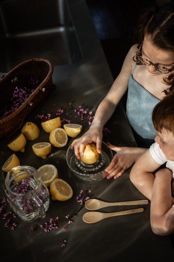
Did you know the answer to foraging perfectly ripe redbuds could be right in your backyard?
Foraging Redbuds
Just before school doors close for the summer, the landscape in April explodes with pinky-purple hues by way of the Redbud Tree. Native to eastern North America, the Redbud is one of the first plants to flower as the weather warms. Beyond providing color when we are most desperate for it, the buds, the flowers, and the seed of the tree can be eaten raw, pickled, cooked … or steeped.
Young entrepreneurs should not miss out on opportunity for an all-natural lemonade stand with some extra color-changing magic. A seeped dull purple tea of foraged redbud blossoms and water pops neon pink when combined with lemon. It’s a chemical reaction that feels like magic! Add sugar, a clipped bouquet, and a roadside stand, and none can resist.
Making Redbud Lemonade
If you’re looking for a way to use your collection of redbuds, a Redbud Lemonade can be a refreshing treat. Whenever you add redbuds to lemonade, it creates an almost floral flavor with hints of tangy sweetness and a slight note of vegetal taste. Not to mention, the color is just gorgeous and is such to create the picnic of your dreams.
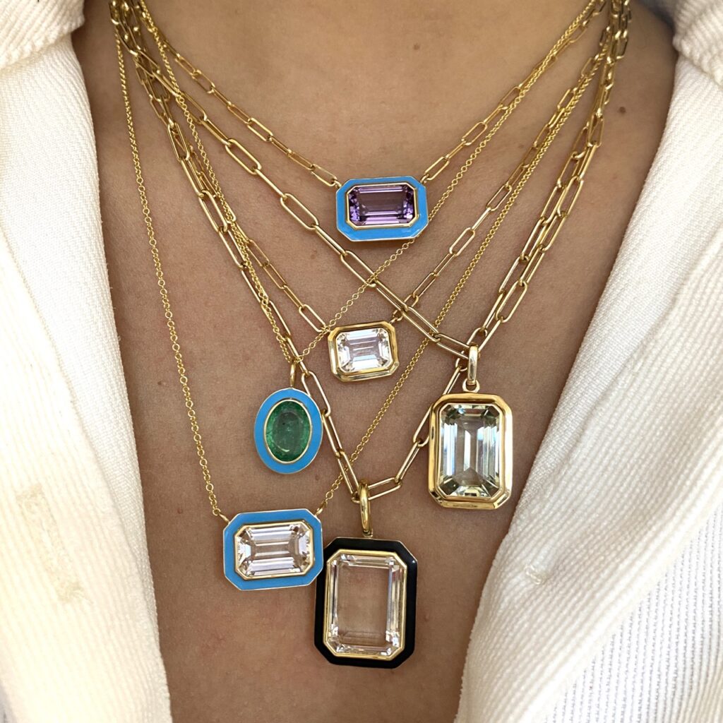
Soft blues and whispered cool greens are colors of the natural world and a huge part of 2025 design trends. They carry Mother Nature’s messages of peace and plenty, and nourish us in the process.
Cool Greens and Soft Blues Shine in 2025 Design Trends
Usher in an eternal spring with colorful precious gemstone and enamel pendants by Goshwara. Made with amethyst, rock crystal, and emerald set in 18K yellow gold. These talismans of fair weather and good feeling will never dim.
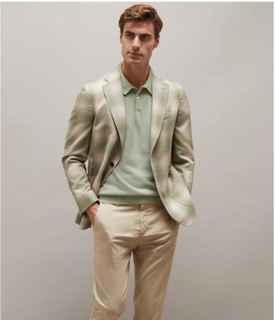
Breezy and good looking for all the warm weather months, Baldassari’s wool, silk and linen jacket and cotton polo channel the refreshing, cooler-than-thou energy of celadon. Made in Italy. Available downtown and online at Larrimor’s.
The Bria Ribbed Cotton Fringe Mock Neck Sweater Tank gifts its wearer with a flutter of fringe around the armholes and waist. 100%cotton. Available at Shadyside’s Madeleine George.
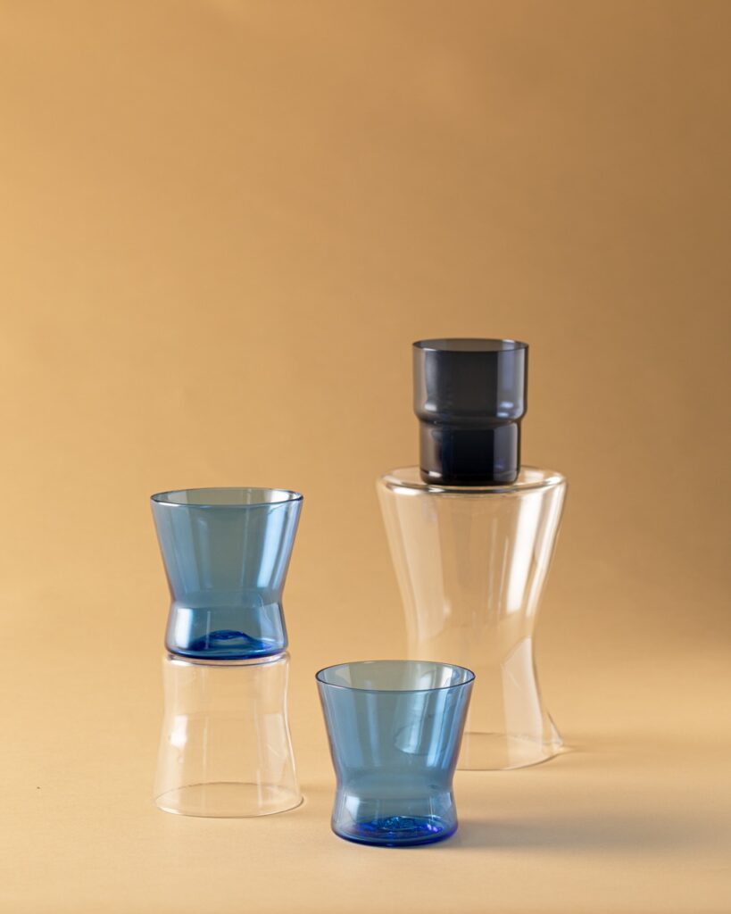
Jason Forck designs his Penn/Fairmount line with a minimalist Scandinavian aesthetic. The clean lines of the Cinch pitcher and drinking glasses shown here in blue and clear allow the user to enjoy the refined silhouette while also being able to enjoy the aesthetics of the drink within,” Forck said. Cinch was inspired by a pitcher and tumbler (the latter shown here in dark blue) by Finnish designer Saara Hopea-Untracht from 1951; a pale green set is in the collection of the Carnegie Museum of Art. Photo by Dave Bryce.
Story by Stephen Treffinger, Danny Mankin, Keith Recker, and Abbey Cook
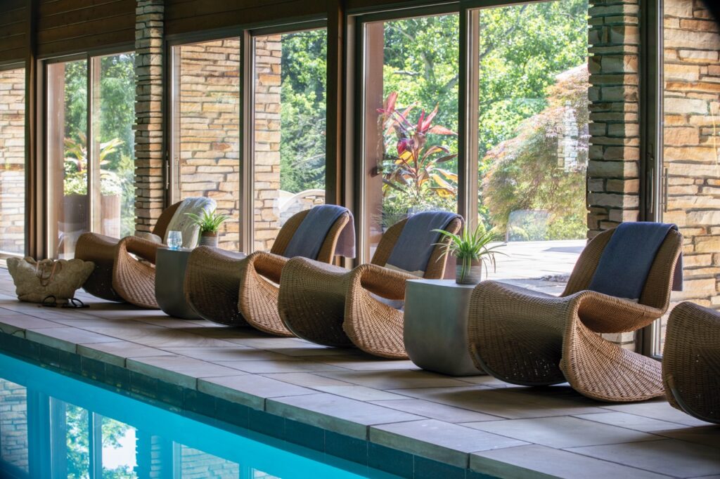
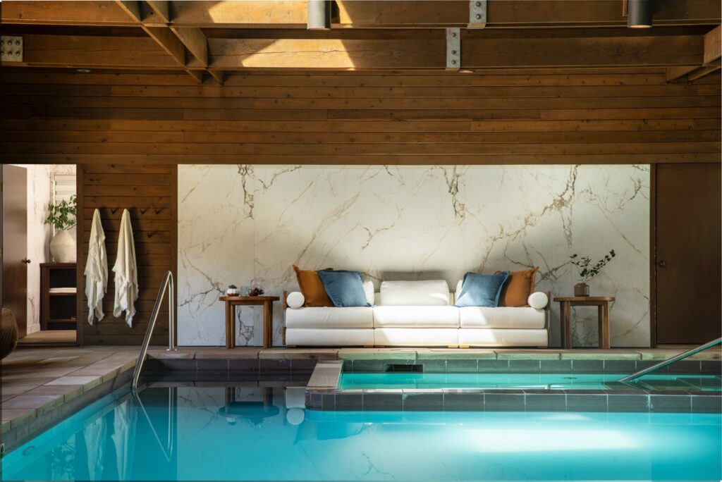
Interior designer Seashal Belldina freshens up a forty-year old, Frank Lloyd Wright-inspired contemporary home. Her intervention created a lighter, brighter place for family living and entertaining.
Seashal Belldina Freshens a Frank Lloyd Wright-Inspired Home
This stunning house is infused with a feeling of openness and flow — yet it was ready for a refresh. The goal? Maintain the integrity of the original design and deliver a modern organic spin on an already beautiful structure.
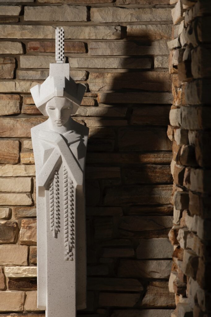
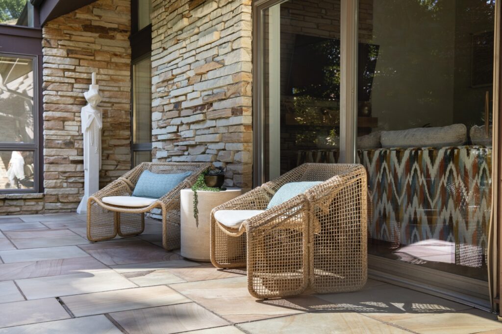
Seashal Belldina of Interiors by Seashal managed the renovations, interior design, and home furnishings. Built in 1985, the home’s owner and their architect were influenced by Frank Lloyd Wright’s Fallingwater. (Fun fact: The patio is now home to one of Wright’s original Midway Gardens Sprite sculptures.)
Mixing Beauty and Function
Belldina approached the project with the central questions that guide all of her work: “How can we make the space feel more functional for you or for your family if you have children? What’s your personal style? How can I blend the architecture of the home, functionality, and the homeowners’ style to create a place that will bring them joy every day and will feel like home?”
Furthering the Feeling of Comfort
Knowing the home would be for plenty of gatherings and playtime for kids, Belldina placed an emphasis on durable and easy-to-clean materials. “I understood the goals that the homeowners had. I’m a mom myself that also loves to entertain. They said, ‘We don’t want it to feel like a museum. We want everyone who steps into our home to immediately feel at ease — like they can kick back, relax, and make themselves at home. Picture them sinking into the couch, grabbing a pillow, and unwinding.’”
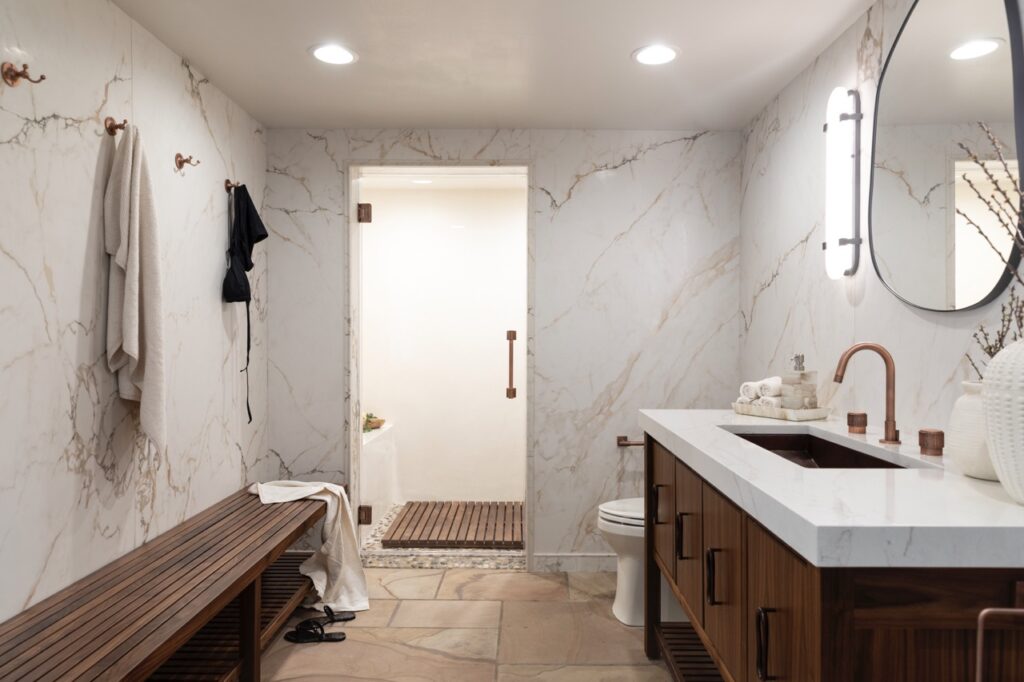
Belldina worked with the existing sandstone flooring and walls by pulling in complementary warm and neutral tones. “The homeowners gave me a lot of free reign on this, which is a dream for an interior designer. But the one thing that they stressed was to make everything lighter. It was really dark and heavy before — the paint colors, tile choices, flooring, everything. They also preferred neutral palettes, but were open to some bold pops of color.
Story by Nicole Barley Photography by Dave Bryce Interior Design by Seashal Belldina
What kind of kitchen is right for one of the hardest working people in the restaurant biz? One that brings a sense of peace and order. Visit the kitchen of Tolga Sevdik, co-owner and COO of the Richard DeShantz Group with us.
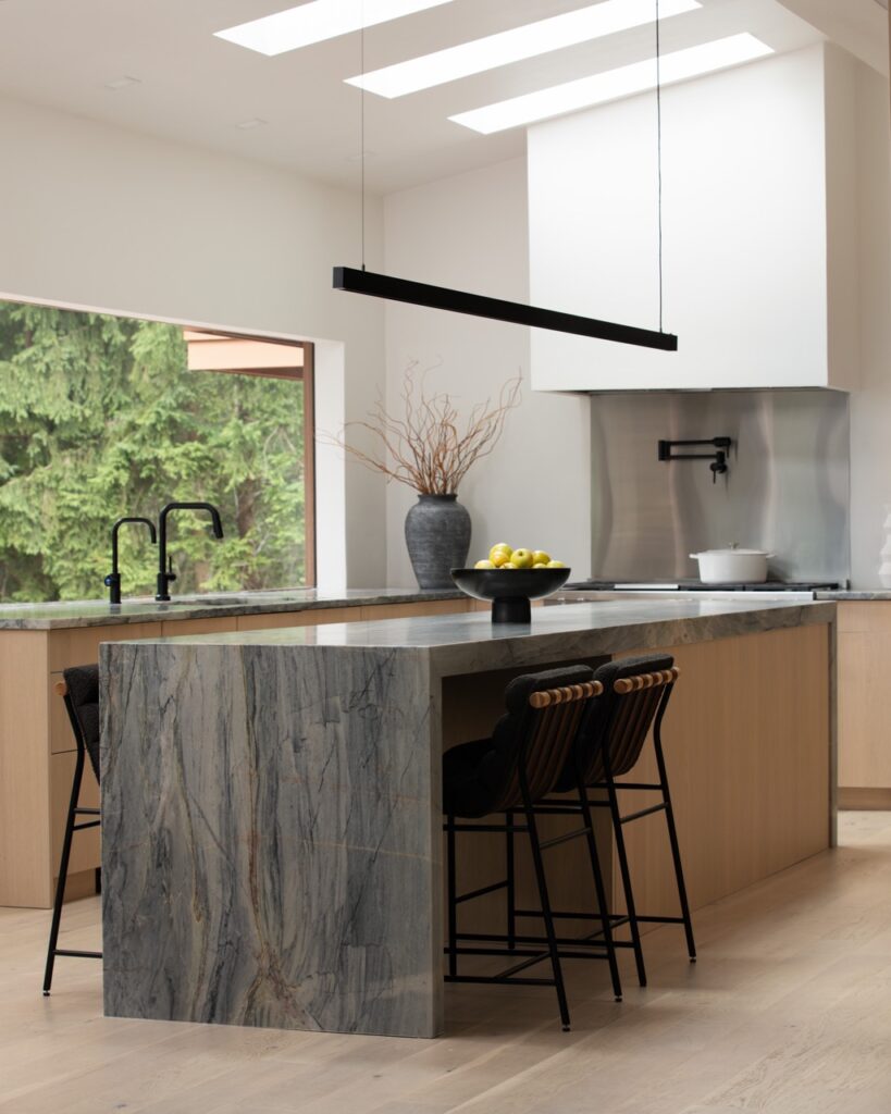
Explore Tolga Sevdik of Richard DeShantz Restaurant Group’s Kitchen
So, if Tolga makes it home in time to kiss his 2- and 5-year-old kids goodnight and grab a bite to eat with his wife, Alicia, he’s yearning for peace, simplicity and an easy cleanup.
The Quiet of the Suburbs and Design
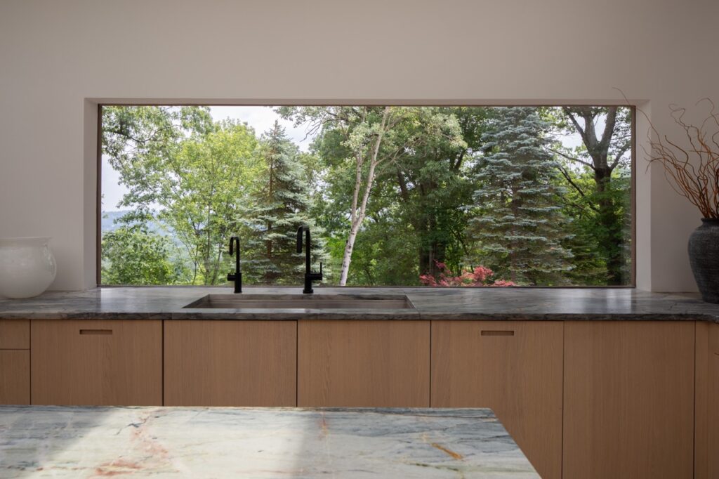
The Sevdiks live in Thornburg, a tiny borough on a bluff surrounded by scenic views about four miles west of downtown Pittsburgh. Tolga, who emigrated from Turkey in 1995, says his goal was to turn the outdated kitchen along with a space the former owners had used as a TV room into a European-style kitchen that would be “easy for us to have a quick sit-down breakfast or dinner and then move on.” He also wanted the space to work as an event/party kitchen. Having watched his partner “Rick” DeShantz design many kitchens, Tolga also was determined to avoid pitfalls. “You learn a lot from building 10 restaurants,” he says.“You see [all the] mistakes.”
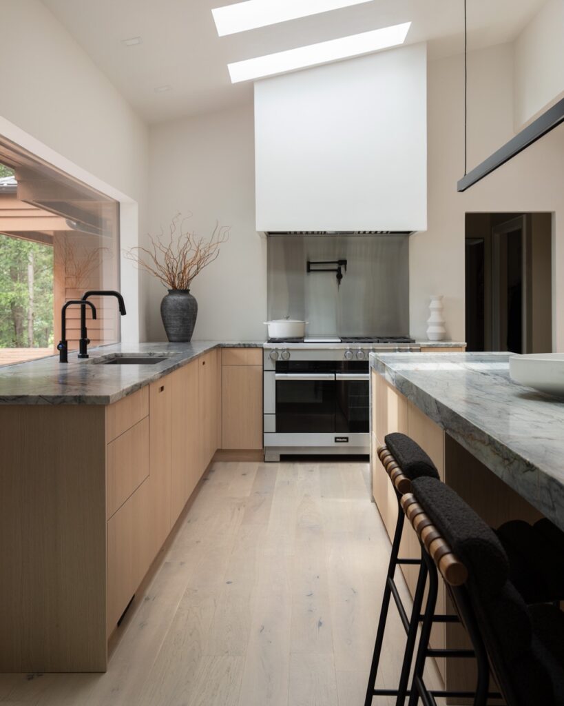
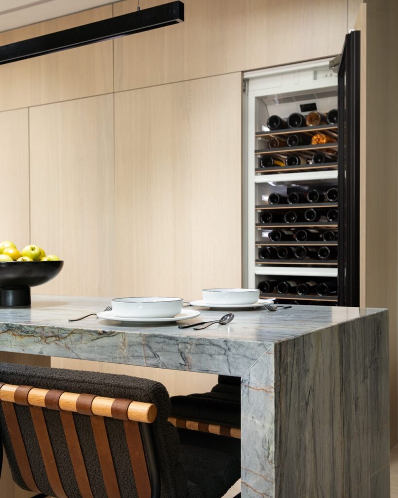
Chrissy Norman of C Norman Design brought the Sevdiks’ vision to life with the help of Matt Bauer Contracting. Removing several walls provided a sightline from the kitchen through the dining room to the living room, which also makes it easy for Tolga and Alicia to keep an eye on the kids. Slim black shelves created a home for their books and pottery and flank a cozy reading space that transitions to the dining room. The dining room can now accommodate a long rectangular table for holidays, but most of the time the family gathers around the kitchen’s center island.
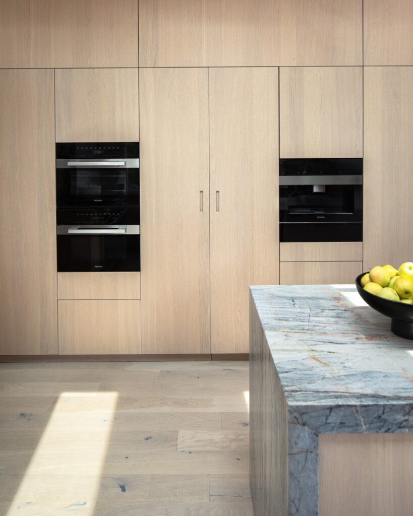
Pulling From the Best Brands for Kitchen Design
Installation went smoothly, and the finished kitchen’s vibe is as serene as intended, thanks to pale wall colors, lightly veined gray blue Armina Stone countertops, smooth DOCA cabinetry from DB Design Center, white oak flooring, and a huge picture window from Emerald Glass that turns the surrounding landscape unto a mural. “I ordered the largest window I could find,” Tolga says. In the warmer months, their view is pastoral, but when the leaves drop, “we can see all the way to the Parkway,” he adds. There are plenty of modern (but quiet) bells and whistles — a wine fridge and bar, a pot filler over the stove, invisible electrical outlets hidden in the walls, and some “hard-to-find” Miele appliances sourced by Don’s Appliances.
Both Alicia and Tolga cook, but unless it’s Sunday or Monday, his days off, it probably won’t be gourmet fare. Sometimes Tolga just grabs a piece of steak on his last stop of the day and heads home. “You have to have a grill,” he says, laughing.
As with most families, the Sevdiks and their friends tend to gather in the kitchen. No matter the style, the comfortable versatile space is a pleasant reminder for Tolga of times past in his grandparents’ home in Turkey. “You were aways in the kitchen,” he says. “Almost everyone in the family gathers there.”
Story by Susan Fleming Morgans Styling by Justin Matase Interior Design by Chrissy Norman of C Norman Design Photography by Dave Bryce