As design story writers, we classify our subjects into predefined categories: modern, traditional, high-end, and the somewhat elusive “transitional.” Many designers comfortably fit within those boundaries. But when working with Ford to translate his recent work into a book, our challenge and a source of excitement was to approach it in an entirely new manner.
Avoiding the trap of strict categorization, the pitfall I wanted to avoid was creating a long magazine article with the usual well-trodden tropes: breathless descriptions of unusual fabric finishes, complicated floor or wall treatments, and important pieces. Such an approach wouldn’t do justice to Ford’s work, process, or personality. His style embodies a relaxed demeanor while effortlessly maintaining an air of nonchalant elegance, favoring chic over shabby.
One thing that makes describing Ford and his design process difficult is that he doesn’t have a set formula, a “Huniford style” or “Huniford look.” (I joked with him that it would have been much easier for me as a writer if he did, albeit certainly less interesting for his clients.) So, the idea was, instead, to describe his approach and inner workings. And to get across his personality, which is a big part of the equation.
There isn’t some veil between private citizen Ford and designer Ford; he treats everyone pretty much the same. He is gregarious and the sort of director who effortlessly connects people from the worlds of art, design, theater, finance, and his charitable endeavors with admirable ease. It was important to convey that right from the start, so I chose to describe a small moment representing the larger picture.
How, then, does one describe what someone does if it can’t be immediately expressed in the usual ways? Spending time watching him work was, of course, essential. Long talks about favorite places, rooms, and colors–of course, helped begin to paint a picture. Sometimes, it was more about patience, hanging back, and allowing him to talk in a stream of consciousness until clear patterns began to emerge. It was my job to find the thread and follow it, identifying ways to express a common ground even in projects that––on the surface––look quite different.
Ford and his team had compiled a list of chapters before I was brought on board. After our initial conversations, we massaged these some and reworked the order. The final lineup included topics including Approaching a Room, Scale, and Proportion, and Exploring Color.
The next step was to sort his projects into chapters–more complicated than it might sound. I was handed an enormous pile of photos and spent many days dividing and pinning them all over the walls of his conference room in giant collages. More sorting and shuffling ensued (right up to the very end), and images––or even whole projects–– were added to or removed from the mix as the book evolved.
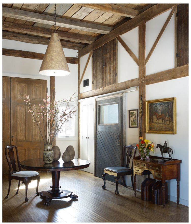
One of the chapters Ford had suggested early on was about scale and proportion, an important part of any interior designer’s art, but in his case, arguably more than for some others. It’s rare to find someone who can operate on both macro and micro levels with such confidence.
In putting the book together, we had the luxury of re-shooting nearly every project, all with the same photographer–the immensely talented Matthew Williams. Walking through the spaces rather than only seeing cropped photos was invaluable, allowing me to access information the reader can’t always register, no matter how splendid the photos are. It is a sort of emotional temperature and atmosphere that one picks up in space. It also helps one to draw attention to things someone leafing through might not immediately notice.
Few realize how involved photographing these projects can be, a handful of pictures requiring the participation of several people and an entire day of shooting. Furniture is moved around and around (and, yes, even the writer helps). Flowers are arranged. Pillows are indeed fluffed. Does that table need another book on it? Do we really want to see the back of that chair? Is that too much?
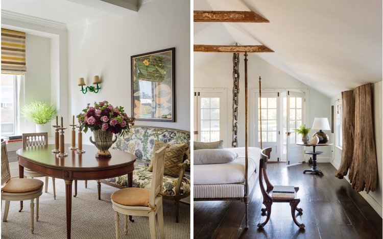
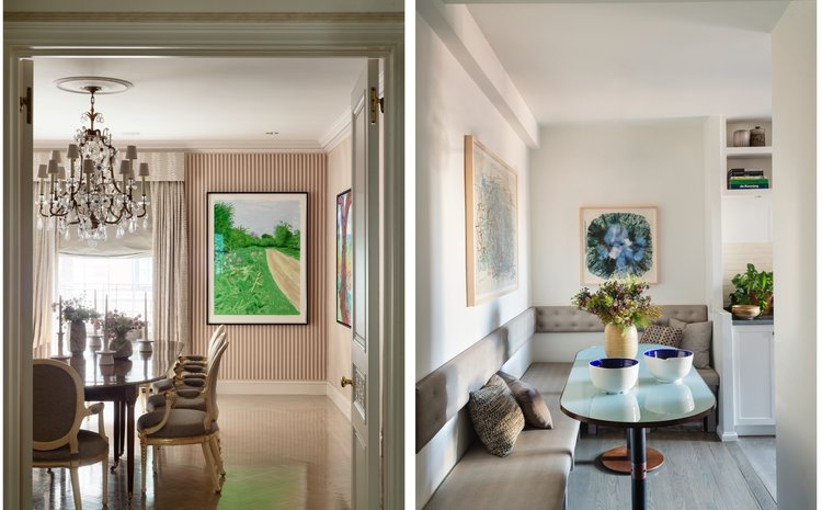
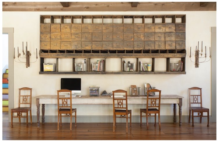
In Ford’s world, rooms don’t contain four seating areas when one or two will do. Walls tend to be one of myriad shades of near-white with a soft-spoken blue or green tint. (The rooms in his own beach home in the Hamptons have painted a shade of his invention called Foggy Summer Squall.) The overall effect owes more to subtle layering and careful juxtaposition than to sparkly bits or jarring colors.
One thing Ford really wanted to get across was the sense of dramatic tension in his work. It is, to be certain, nuanced and often quiet––but germane to what he is all about. It draws you in and makes you feel involved in the space, a participant rather than an observer. It shifts the focus back to the occupant and away from the designer––a generosity that perfectly represents him.
James Huniford: At Home (Monacelli Press, 2020) is available at fine booksellers near you or online.
Story by Stephen Treffinger / Photography by Matthew Williams, Max Kim Bee, and William Waldron

Subscribe to TABLE Magazine’s print edition.
