Sometimes a renovation goes on for so long that your home takes on a sort of local notoriety. “Oh, you live in that house,” people would say to Colleen Simonds of her two-and-a-half-year-long project in Shadyside. The location on a relatively busy corner made it even more visible to the neighbors, and took some getting used to after living in an apartment in New York City for 15 years.
Like most construction projects, what started out as a fairly quick process eventually blossomed into something much larger, including adding an addition to the house and gutting the kitchen and elsewhere. Everything was basically rebuilt from the ground up. The kitchen itself, in this traditional circa 1911 Foursquare, had high ceilings — pretty much the only thing that was retained. The major layout change was that the current eat-in dining area was swapped in for the separate original, and more formal, room.
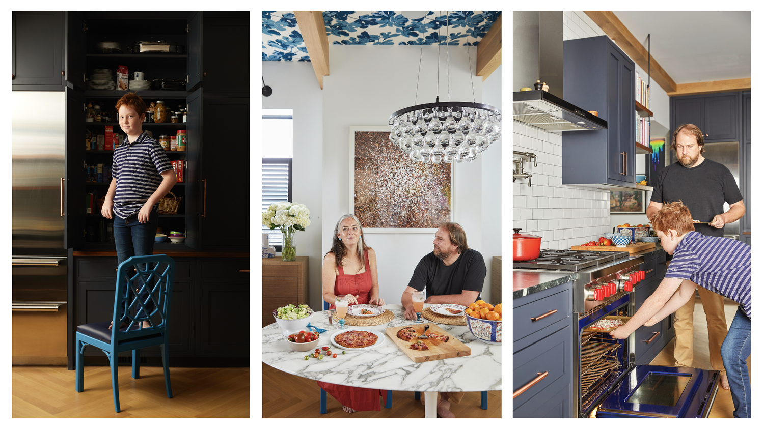
Simonds admits she is not a great cook, although she wishes she were; rather, her husband is the chef in the family, and he had a fair amount of input into how the kitchen should operate. “We did spend a lot of time thinking about where things needed to be and the functionality,” she says. “It’s definitely a working kitchen that we use a lot.”
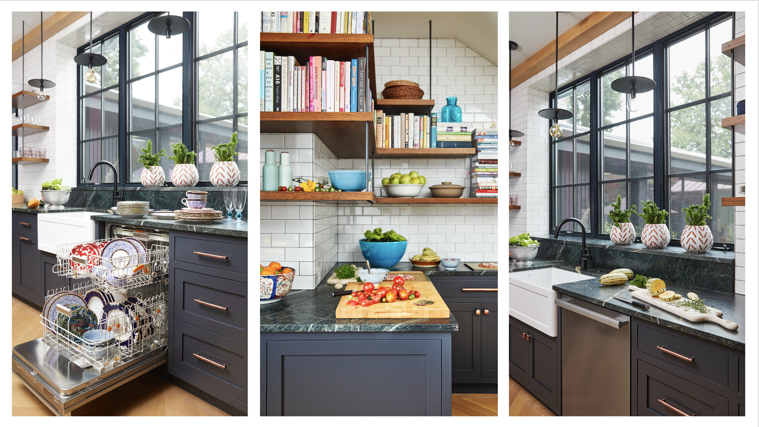
The overall footprint of the original structure wasn’t altered, so there were certain limitations. There was no room for an island, for example, because the kitchen couldn’t be made wide enough to incorporate one. Instead, it is a generous galley kitchen with plenty of counter space and cabinetry, much of the latter floor-to-ceiling.
One of the first striking things about the space is the cabinetry, which is painted a dark blue shade, Railings by Farrow & Ball. “It’s a very dark navy that some people think is dark gray. I chose it because I love navy, but also because it’s easy to live with. It’s not anything I’m going to get sick of.” Such a dark hue could be risky in the cloudiest city in the US (says the World Atlas), but the kitchen possesses several attributes that make it work, including high ceilings and a large window that lets in a lot of (often gray) light. “I was never going to have a plain white kitchen.” A peek at her website shows most decidedly that Simonds is not color-shy.
An expanse of soapstone countertops, also in a gray-navy with veining that can sometimes look green, constantly changes color depending on where you are standing and the time of day. “I love marble . . . for other people. But for here it didn’t seem like the right choice.” Soapstone isn’t indestructible, but Simonds is okay with that. “It does scratch a little bit, is a little softer, but that doesn’t really bother me.” She also likes how it plays with the blue of the cabinets and other elements in the room. “I like the drama of it. It almost makes the cabinets look a little bit more blue.”
Appliances were chosen for function and, of course, their good looks. The dual-fuel Wolf range has a continuous top rather than separate ones for each burner, a plus for moving around lots of heavy pots and pans in the heat of meal preparation. The Best Eclisse range hood was chosen for its minimal profile, again providing lightness. Likewise, the Wolf microwave is a drawer model that lives under the counter. “I don’t like to look at a microwave up on a shelf.” Those shelves are custom-made and more or less float, allowing the white subway tile to reflect and scatter the available light.
The bar area has plenty of storage space for wine and glasses, and includes a mini sink, small Sub-Zero refrigerator for wine and nibbles, and a small Fisher & Paykel drawer dishwasher. Nearby a breezeway connects the garage and her office (the addition) to the house, and includes a long row of blue floor-to-ceiling cabinetry that matches that in the kitchen.
For the now-integrated dining area, Simonds opted for an exuberant color mix. She began with a classic, the Saarinen table, and layered on from there. “We’re a young family with kids and I wanted the space to feel not so serious, kind of fun. And practical because this is where we eat all the time.” She bought vintage chairs and rehabbed them, something she loves to do for clients as well. “You get something one-of-a-kind, interesting looking, and less expensive than brand new.” The two large panel paintings on the wall above the sideboard are by Pittsburgh artist Mia Tarducci, who’s also a friend. They never had room to put them up in New York, so it was always planned they would be used here.
The wallpaper, bold as it is, actually came later. “I didn’t plan that up front, but the room needed one other thing. It was too white with all the walls and ceiling, and it needed another element. I didn’t want to put in a rug—I don’t put rugs under kitchen tables because they get gross—so I ended up adding the wallpaper.” (It’s Peter Dunham Fig Leaf in blue on white, a particular favorite of Simonds). With the ceilings being so high, the graphic pattern draws your eye upwards but doesn’t overwhelm. “It pulls in the darker tones from the cabinetry and the brighter blues in the chairs and the paintings. It’s happy. I like spaces to feel optimistic.” colleensimonds.com
APPLIANCES SOURCED BY DON’S APPLIANCES
Wolf Transitional Drawer Microwave
Best Eclisse 36-inch Wall Mount Chimney-Style Range Hood
Wolf Legacy Dual Fuel Range
Sub-Zero Designer Undercounter Beverage Center
Fisher & Paykel Integrated Single DishDrawer™ Dishwasher
Story by Stephen Treffinger / Photography by Dave Bryce / Styling by Keith Recker / Design by Colleen Simonds
Don’t miss a single beautiful thing: Subscribe to TABLE Magazine here!
