Why do leading trend agencies, paint brands, and others, choose a color to express the feeling and emotion of an entire year on this complicated planet? Trend Bible’s US trend editor and TABLE Magazine contributor Abbey Cook gets into it by analyzing the 2025 Colors of the Year.
Analyzing the 2025 Colors of the Year
For the past 25 years, we have been living in a Color of the Year-inflected world where leading trend agencies and paint brands choose a color of the times. Why do they do it? Love them or loathe them, their choices focus our attention on the choices the design world offers consumers, arguably whetting our appetite for options that suit us. Color of the Year programs receive lots of press coverage, giving companies a chance to affirm their expertise and cement awareness of their work broadly in the marketplace. Let’s look at four companies who sparked up the color conversation with their picks, along with Pantone, who also pioneered the concept in 2000.
Color is powerful and creates change, not just in our homes, but all around. It should be noted these colors aren’t randomly plucked from a hat. A great amount of research and thought goes into choosing why companies see these individual colors as important in the year to come. Art, fashion, climate change, politics, restaurants, social media, and just about everything you see and touch, are studied by trend forecasters and color strategists, helping to determine the mindset and culture they expect to see in the coming year.
How All the Colors of the Year Come Together
To our delight, displaying these five 2025 Color of the Year choices side by side formed a designer’s dream palette. Together they create an earthy and comforting range, with bold blues that contrast beautifully with the browns and reds. The delicious invitation to mix and match the choices of the five influencers we chose sets 2025 apart from previous years.Perhaps this is a sign that 2025 can be, recent news cycles notwithstanding, a year of coming together collectively to focus on the planet and each other while helping to design the world into a more united place.
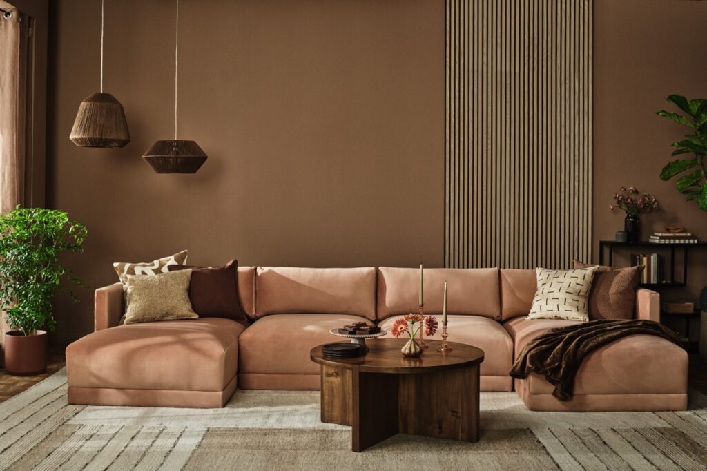
Pantone – Mocha Mousse
The company that put Color of the Year on the map has chosen Mocha Mousse for 2025, a milky tan with cinnamon undertones alluding to the trusty basics we know as brown and beige. This is not a wild card choice for 2025: we needed a soothing neutral after years of dopamine brights ready to be photographed for the ‘gram.
Mocha Mousse acts as an elevated brown that will be found in accessories, wood furnishings and textiles throughout the home. Who wouldn’t want to wrap themselves in a luxurious Mocha Mousse cashmere blanket? Or lean into the cafe vibe of this color and use it in the kitchen with earthen tabletop pieces from East Fork Pottery or Heath Ceramics while you brew your cafe latte. One could even merge food and design by spooning real Mocha Mousse into a chocolate-colored bowl: our eyes would admire the monochromatic still life as much our taste buds. However the color is used, the beauty of working with it lies in its harmonious and grounded sophistication and its unassuming but all-knowing air.
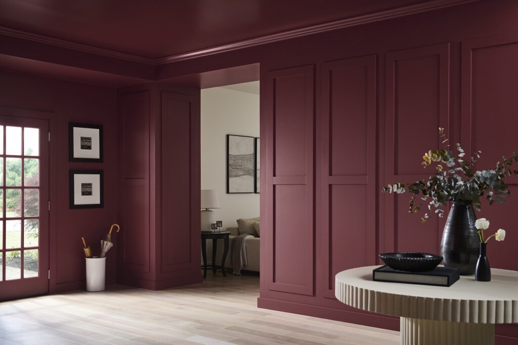
Behr – Rumors
Behr chose a sultry ruby red with brown undertones and spice notes that has timeless appeal. According to a recent survey commissioned by Behr, “More than three-quarters (76%) of Americans would consider painting a room or wall a shade of red and more than half (61%) agree bold red walls feel warm and captivating.” The beauty of Rumors lies in its duality. Like a good friend, it invites you into a room and envelopes you in a warm hug. Yet it’s also luxurious enough to transport you to a five-star hotel. It pops against light neutrals and adds a flair of depth and drama when paired with dark woods.
This is the perfect shade to introduce into a dining room or kitchen as it stimulates the appetite. The confident red transitions well into any room bringing a wealth of hospitality to an accent wall when set against a fireplace or in a powder room to jazz up a cozy environment. This is a classic red that boldly adds depth and comfort to the Color of the Year lineup.

Benjamin Moore – Cinnamon Slate
A nuanced mix of “heathered plum and velvety brown” makes up Benjamin Moore’s Color of the Year, known as Cinnamon Slate. A new neutral with hazy undertones, this is a great color to change things up with big impact but without a lot of unnecessary noise. It works well with browns from caramel to chocolate, textured creambouclés and even a rich indigo like WGSN’s Future Dusk. The color’s mauve putty value will soften any room, suggesting a serene escape into the English countryside. Pair it with a chintz floral wallpaper to emphasize sensation. A bedroom accent wall in this muted color would create a soothing environment while still injecting some character.
For a modern take on a Southwest desert style, use it as a backsplash in the kitchen as the color nods toward an adobe stucco. Forecasters think we will be entertaining more at home in 2025, and we are likely to see tabletop textiles and accessories in this color. Look to heritage-crafted products such as block-printed linens from Soil to Studio where folk inspired florals pair with imperfect stripes.

WGSN – Future Dusk
Like Pantone, WGSN is one of the top trend forecasting agencies in the world. Major brands and retailers look to the agency’s experts for guidance in creating and marketing new products. Their 2025 color, Future Dusk, is a saturated, celestial indigo that is “familiar and futuristic”, mirroring the unknown characteristics of this complex year. An otherworldly color, it adds a bit of regal, intriguing flair to the home. It is alive enough to carry a hint of eccentricity and electricity, and yet, as a blue, stable and familiar enough to be a versatile player.
Paint a small room in this opulent shade to feel like you’re stepping inside a satin lined jewelry box. Or use it sparingly in accessories to provoke and engage the eye and invite the seer to stay for a while. Limning between purple and blue, this moody color almost suggests iridescence and would radiate on tiles like the handcrafted ones from California-based company, clé. It would also make sumptuous wallpaper in tonal patterns to dress up a small bathroom or enliven a living room.
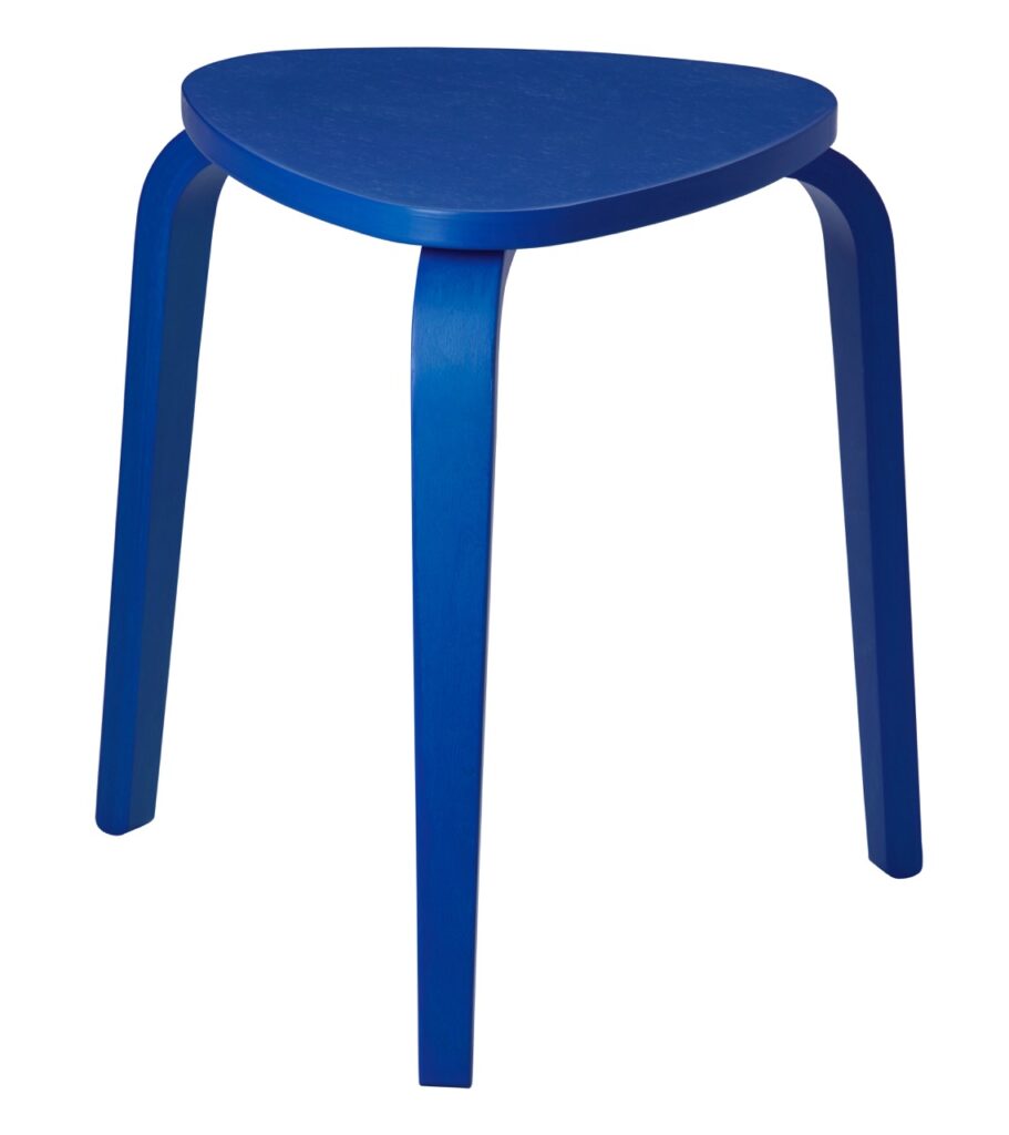
IKEA – Electric Blue
For the first time ever, IKEA decided to join the Color of the Year cohort. Even though it’s a lifestyle brand, their use of color and style has long been a leader in the interior design industry, so it makes sense to add their name to the game. They chose Electric Blue for 2025, a color that stands out and commands attention.
This vibrant blue is the perfect accent for home accessories, much like jewelry completing an outfit. It looks fresh when applied on a modern silhouette, such as IKEA’s minimalist Kyrre stool, which packs a perfect punch of color in a kitchen or bathroom corner. Or update a retro lamp in a glossy finish to make an office desk pop with the click of a switch for a literal Electric Blue moment. This color is loud and energetic, adding playfulness to the ‘kidult’ trend that will be big in 2025. Create this style using fun décor pieces such as quirky clocks or whimsical patterned pillows. Consider this color to be your standard of cool in accessories that will work for years to come.
Story by Abbey Cook
Subscribe to TABLE Magazine’s print edition.
