Sewickley-based designer Betsy Wentz embraces a palette of colors, finishes, and materials that could be described as a well-modulated kaleidoscope. Her new book, Design Happy, tells the whole tale.
Antidepressant Color
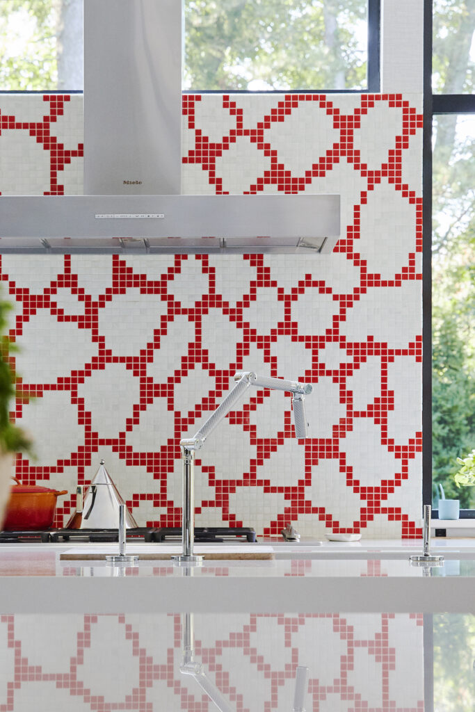
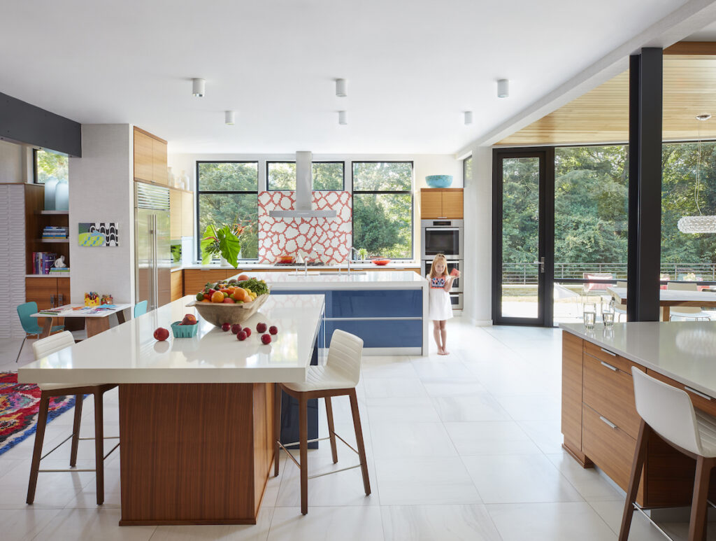
One of interior designer Betsy Wentz’s mantras is “if you love something, you should go with it. If you love it now, you’re going to love it later.” What she herself loved was a bright orange-and-white-tiled backsplash in the kitchen (it was a starting point for the home’s design scheme). “People ask if I won’t tire of it, but it’s been 10 years and I still love it.”
Author of the new book Design Happy, Wentz is known for her exuberant use of color and her ability to mix patterns (and much more, of course). The book, a collection of 12 recent projects, offers practical tips for decorating — whether you can afford a designer or not. “It taught me so much about my process. It ultimately made me a better designer.”
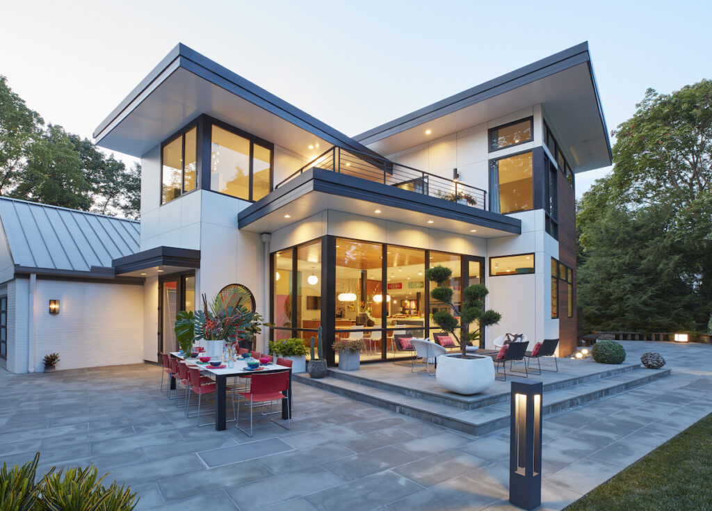
Wentz lives with her husband, Chris, and their four children, in a modified 1970s home, which she originally spotted while out jogging one day. She especially loved the setting, which included a series of old stone walls, onto which she later added. They expanded the original footprint of the house by adding what is now a glass-enclosed dining area, a mudroom, and the primary suite.
The home is a three-dimensional cure for Pittsburgh’s notoriously gloomy weather. As much as she loves her outdoor spaces, the family only gets to really enjoy them for three or four months of the year. “It’s really important to make the inside of the home what you want it to be, because that’s where you’re going to be spending your time.” She wanted a cheerful home that was livable with the kids, a place that was happy and where people wanted to be.
Make it Casual
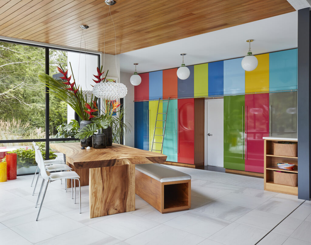
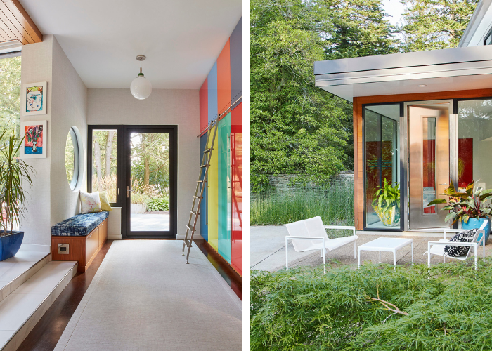
Because they are not a no-shoes-in-the-house kind of family, Wentz didn’t feel the need for a formal dining room. Instead, she designed a combination entry, dining space, and mudroom. The floor-to-ceiling glass lets you overlook the property, and the room is set at an angle to the rest of the house, giving it a less rigid vibe. Instead of a series of plain white cabinets, Wentz had fun with the mudroom locker doors and painted each one a different favorite color.
A sort of mirror-image space, a breakfast nook, is placed within a second glass box, this one near the front door that is painted a bright persimmon color, nearly identical to that of the backsplash, in automotive lacquer. The curvy chairs are vintage, covered with a tie-dyed velvet fabric, while the cobalt blue coatrack, from a 1950s World’s Fair, was a gift from neighbor Peggy Ray.
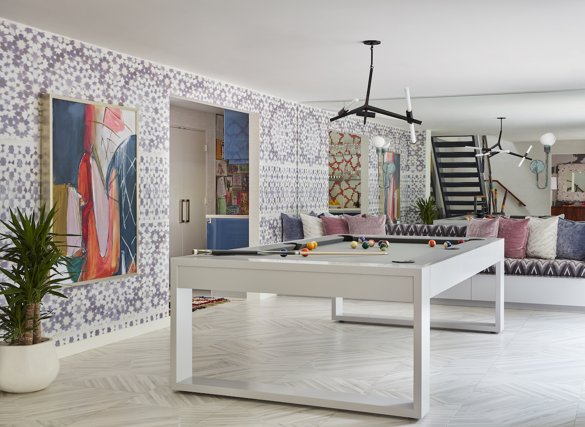
In what used to be the dining room, she made a combination gaming and hangout space with a pool table and custom built-in seating. Here, the kids can have a game while waiting for dinner, or they can read or do homework. The tile floor is both casual and practical—it won’t scuff or scratch the way hardwood could. The living room’s bonsai-patterned wallpaper makes an unexpected backdrop for a vintage rosewood console. “When you layer in vintage pieces the way that we do–including vintage rugs–it’s a little more curated and editorial.”
A Little More Neutral
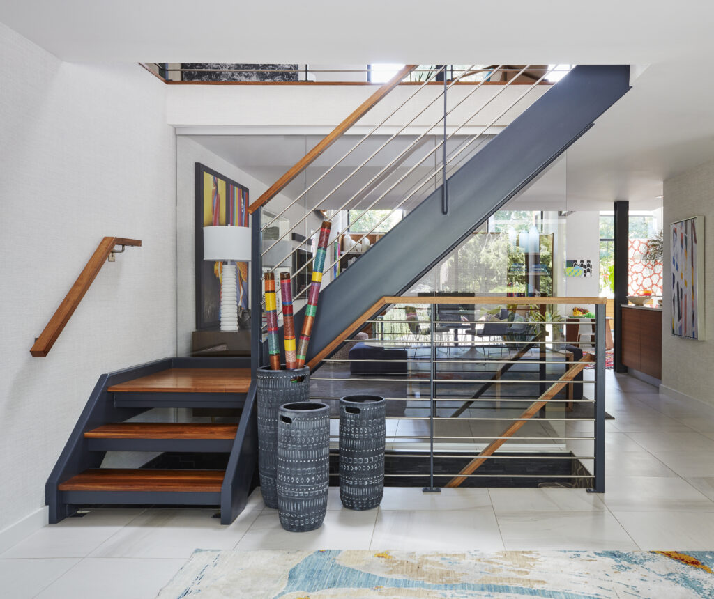
Upstairs, the children’s bedrooms surround another hangout space where the kids play Xbox, read, or watch movies. The artwork over the stairs was actually something she saw and fell in love with years ago. It turned out to be a painted bed sheet she spotted in the window of a shop. She bought it for $100 and had it stretched on two-by-fours. In her daughter’s bedroom, she employed a favorite technique, putting cork on the wall and covering it with sparkly paper that doesn’t show pinholes. Her daughter can put up favorite artwork, swimming and soccer medals, and swap them out whenever she wants.
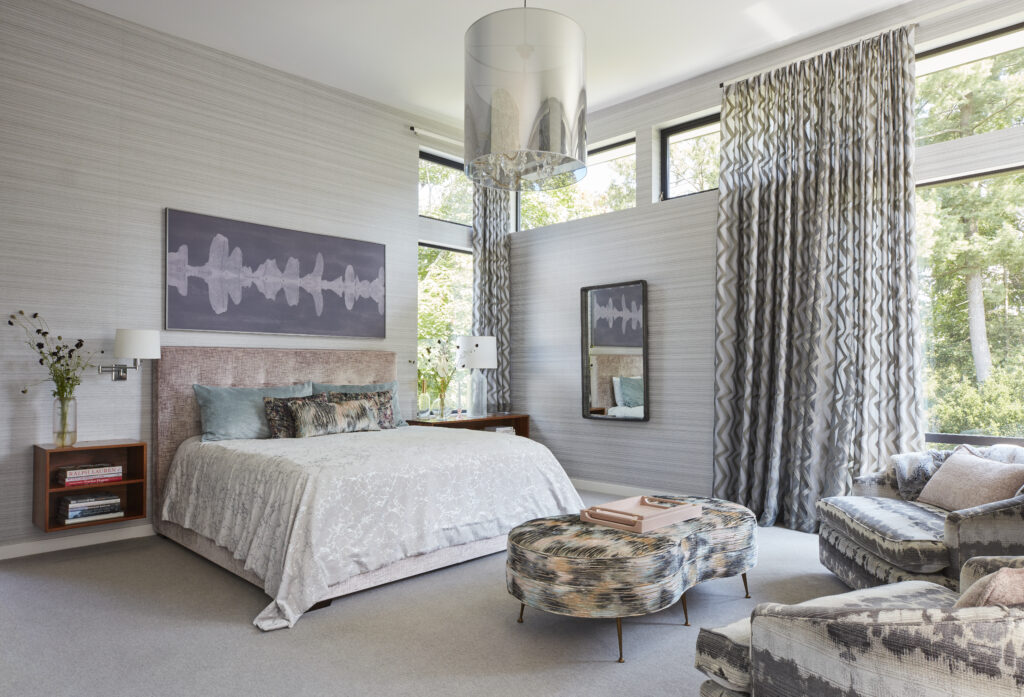
In the primary suite, the palette reads much more neutral, the desired effect being one of relaxation, a place that serves as a retreat. There’s plenty of glass to take in the landscape, but strategically placed walls stop it from being too bright in the morning.

Design Happy
Throughout the space, color and pattern is layered in the form of textiles and furnishings, of course, but also with (mostly) vintage rugs, something of an obsession for Betsy Wentz. (She says she picks up new ones every time she visits New York, and has an extremely large collection.) So, does the think it all can go too far? “At some point you have to say, ‘This is too much.’” She likens it to getting dressed—you don’t put on every color and pattern you have in the closet. Something needs to be the pair of blue jeans, the khakis, or the white t-shirt. “That’s how we do it with the rooms. Something has to anchor it. Something has to be the thread. And then you can lay on all this pattern. But at the end of the day, you have to have some relief or else it just looks like a circus. It’s a tricky dance but we get it done.”
Sources
Pool Table: Custom from Pool Table Portfolio, NY
Pool Room Bench: Custom
Various Wallpapers: Elitis
Red Square Glass Pendant: Urban Electric
Fixture Over Pool Table: Agnes Chandelier from Lindsey Adelman
Living Room Pendants: Buba from Viso
Rug, Husband’s Study: ABC Carpet
Rug, Upstairs Family Room: Sari Silk Rug, ABC Carpet
Table in Breakfast Nook: Original Saarinen
Armless Chairs Flanking Breakfast Nook: Vintage, Recovered in Tie-Dye Fabric
Story by Stephen Treffinger / Photography by Carmel Brantley
Subscribe to TABLE Magazine’s print edition.
