Each Fall and Winter, a number of influential individuals and brands announce what they foresee as the “color of the year” for the following year. What follows is typically a frenzy of sorts, with brands rushing to post their wares available in that hue—clothing, tableware, paint, interiors, and graphic design. “Look, everyone. We’re on trend!”
Predicting Peach
For 2024, a number of predictions were were peach-adjacent. Pantone, arguably the most well-known of the predictions, chose “Peach Fuzz”, which it says brings “a feeling of kindness and tenderness, communicating a message of caring and sharing, community and collaboration.”
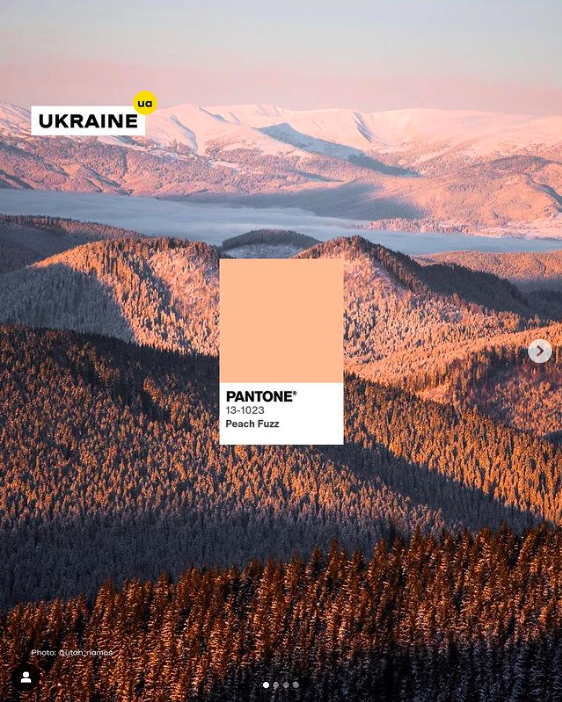
A post from @ukariane.ua, “The official Instagram of Ukraine” which said Pantone’s 2024 color of the year reminded them of “sunrises and sunsets in the Ukrainian Carpathians when the sun plays with colours on the treetops and meadows”
The trend forecasting company WGSN similarly chose Apricot Crush, and HGTV Home by Sherwin Williams chose Persimmon—both shades somewhere between pink and orange. The British paint company Deluxe picked Sweet Embrace, a dustier, softer pink, still in the neighborhood.
By contrast, several prominent brands chose shades in the blue and green family, including Valspar’s Renew Blue (a pale turquoise), Graham and Brown’s Viridis (a near-celadon), and Sherwin Williams’ Upward SW (a pale sky-blue).
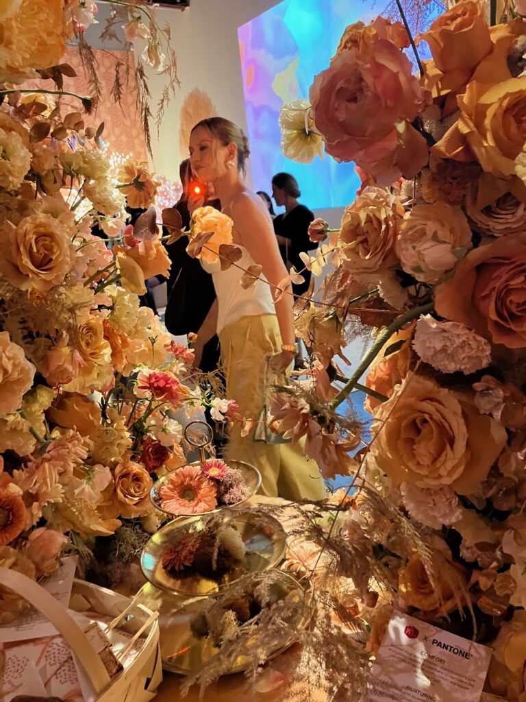
At the launch event of Peach Fuzz in New York, speakers ascribed to it a great number of attributes to it: sophisticated, contemporary, understated, impactful, a reflection of the past, clean, and nurturing. Quite a tall order for a single color!
Staying Outside the Predictions
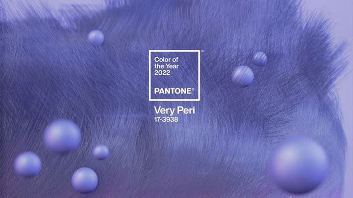
But not everyone rushes to embrace the newly-crowned colors. When Pantone introduced Very Peri in 2022, I interviewed the Paris-based trend forecaster Li Edelkoort for an article in the New York Times. She said the company was “pushing a shade of purplish blue down people’s throats with no relation to the way we are living and evolving. Humans want to be embraced by their environments in troubled times, which doesn’t allow for an invented, non-cool blue hue.”
Can any single shade represent the ethos of, well, everything? Across state lines and international borders? In ceramics, sneakers, and sofas alike? Must everything from the year before be chucked out and replaced each January? The internet suggests a Barbieverse approach: a monochromatic world in which clothing, cars, and (in the case of the movie) even mountains appear in a matching hue.
So, one hopes, the Color of the Year is not a recommendation that everything be produced in it, only to be replaced twelve months later. I think it’s more a chance to be remind you of a color that might have fallen out of fashion, or one that hasn’t gotten much attention in the past. Use it as background thought to lead you somewhere else. It’s interesting that these colors have not been rewarded for achievement or past performance—like Best Picture or Album of the Year—but rather for their perceived potential. Used judiciously, I think that’s worthy of consideration.
Story by Stephen Treffinger
Subscribe to TABLE Magazine‘s print edition.
